Ink & Calligraphy
Japanese Calligraphy: A Guide to Shodō and Its Market
Japanese calligraphy is one of the oldest and most respected of all the brush arts, a discipline in which a single character drawn in black ink can carry as much expressive weight as a full painting. Known in Japanese as shodō (書道, literally “the way of writing”), it sits at the intersection of language, philosophy, and visual art. For collectors, interior designers, and serious enthusiasts approaching the field from outside Japan, calligraphy can feel deceptively simple—just ink on paper—yet it rewards close study with a depth of history and a surprisingly active market.
This guide explains what Japanese calligraphy is, how it developed out of Chinese writing into a distinctly Japanese art, the five scripts you will encounter, the materials and techniques that define it, and the artists whose work commands attention at international auction. It closes by looking at how calligraphic works behave in real residential and commercial spaces, where their restraint and monochrome power make them some of the most adaptable Japanese artworks a buyer can acquire.
What Is Japanese Calligraphy?
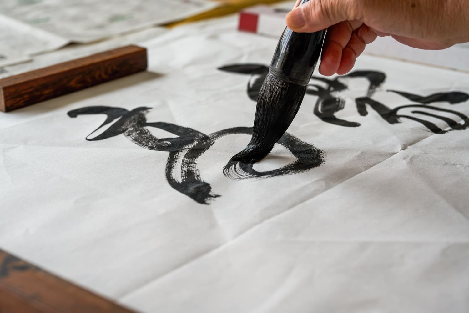
At its core, Japanese calligraphy is the practice of writing characters with a brush (fude) and black ink (sumi) on absorbent paper or silk, in a way that treats the act of writing as an art form rather than a means of recording information. The brush is held vertically and moved with the whole arm, so that every stroke records the speed, pressure, and breathing of the person who made it. A finished work cannot be corrected or retouched; the line that lands on the paper is permanent, which is part of why calligraphy is so closely associated in Japan with concentration, self-cultivation, and Zen practice.
Although Westerners often picture calligraphy as decorative lettering, in the Japanese context it is closer to a performance captured on paper. The viewer is expected to read not only the meaning of the characters but the rhythm and energy of the brushwork itself—where the artist paused, where the ink ran dry into a feathered “flying white,” and where the line accelerated. This is why the same poem written by two masters can look and feel completely different.
From China to Japan: The Arrival of the Brush
Writing reached Japan from China, and with it came the entire apparatus of the brush, ink, and Chinese characters known in Japan as kanji. The transmission accelerated from roughly the sixth and seventh centuries, carried alongside Buddhism, which relied on the copying of sutras (Buddhist scriptures) as a devotional act. For several centuries, learned Japanese wrote in Chinese and admired the great Chinese calligraphers, treating Chinese models as the standard of excellence.
The early high point came in the Heian period (794–1185). The monk Kūkai (774–835), founder of Shingon Buddhism and later honored with the title Kōbō Daishi, is remembered as one of the “Three Brushes” (Sanpitsu) alongside Emperor Saga and Tachibana no Hayanari. Kūkai had studied in China and brought back a command of the brush so admired that legends grew up around it. At this stage Japanese calligraphy still looked essentially Chinese, rooted in continental models.
The Birth of Kana and a Native Japanese Style
The decisive break came with the development of kana, the phonetic syllabaries used to write the Japanese language directly. Hiragana, the flowing cursive script still used today, evolved from simplified, cursive forms of Chinese characters used purely for their sound. Because kana could be written quickly and joined together in continuous, looping lines, it gave rise to an elegant, intimate aesthetic very different from the architectural balance of Chinese characters.
By the mid-Heian period, three aristocratic masters known as the “Three Brush Traces” (Sanseki)—Ono no Michikaze (also read Tōfū, 894–966), Fujiwara no Sukemasa (Sari, 944–998), and Fujiwara no Yukinari (Kōzei, 972–1027)—had established a refined, softened, distinctly Japanese manner known as wayō, or “Japanese style.” This wayō tradition, especially in the writing of kana poetry, is one of Japan’s most original contributions to world art and remains a touchstone for classical calligraphers today.
The Five Scripts and How to Read Them
One of the first things a new collector should learn is that “calligraphy” is not a single look. Chinese characters can be written in several historical script styles, each with its own rules, mood, and degree of legibility. Understanding these scripts makes it far easier to evaluate a work, to read an auction description, and to choose a piece whose visual character suits a particular room. The five principal scripts below evolved over many centuries in China and were inherited by Japan, where they remain the foundation of training.
| Script (Japanese / English) | Character | Visual character | Legibility for a non-reader |
|---|---|---|---|
| Tensho (seal script) | 篆書 | Ancient, symmetrical, pictorial; used on seals | Very low |
| Reisho (clerical script) | 隷書 | Broad, flattened, with flared horizontal strokes | Low to moderate |
| Kaisho (regular script) | 楷書 | Clear, upright, block-like; each stroke distinct | High |
| Gyōsho (semi-cursive) | 行書 | Flowing and connected but still readable | Moderate |
| Sōsho (cursive / “grass” script) | 草書 | Highly abbreviated, continuous, abstract | Very low |
Beginners often assume the most abstract, illegible works are the most casual, when in fact the opposite is true. Sōsho, or “grass script,” is the most demanding of all: characters are radically simplified and run together, so the calligrapher must know each form intimately to abbreviate it correctly at speed. A confident sōsho line is widely regarded as the truest test of a master’s hand.
Alongside these character-based scripts sits kana calligraphy, the writing of Japanese hiragana, prized for its delicacy and the way long passages of poetry can be arranged in scattered, asymmetrical columns across the page. Collectors drawn to softness, lyricism, and pale, watery ink often gravitate toward kana, while those drawn to bold, architectural strength tend toward kanji works in kaisho or reisho.
The Four Treasures: Brush, Ink, Inkstone, and Paper
Japanese calligraphy is inseparable from its tools, traditionally grouped as the “Four Treasures of the Study” (bunbō shihō): the brush, the ink stick, the inkstone, and the paper. Understanding these materials helps a buyer judge quality, anticipate conservation needs, and appreciate why no two works are alike. Unlike oil on canvas, ink on paper is a one-attempt medium in which the surface itself shapes the result.
Sumi: The Ink
Traditional ink, sumi, is not bought as a liquid but as a solid stick that the calligrapher grinds against an inkstone with a little water immediately before use. The stick is made by combining fine soot with animal glue (nikawa) and pressing the mixture into molds. Two main soots are used: pine soot (shōen), which gives a warmer, slightly bluish-black with subtle tonal range, and oil or lamp soot (yūen), which produces a glossier, denser black. The pigment in sumi is essentially carbon, which is exceptionally stable and resistant to fading—one reason centuries-old works survive with their blacks intact.
Fude and Suzuri: Brush and Inkstone
The brush (fude) is made from animal hair—goat, weasel, horse, and others—chosen for the balance of softness and spring it gives. Different works demand different brushes, from fine kana brushes that come to a hair’s-breadth point to broad brushes the width of a hand for large-format modern pieces. The inkstone (suzuri) is a carved slab of fine-grained stone with a flat grinding surface and a small well for water; prized antique inkstones are themselves collectible objects. Grinding the ink is regarded as a meditative preparation, settling the mind before the first stroke.
Washi: The Paper
Most calligraphy is written on washi, traditional Japanese paper made from plant fibers such as kōzo (paper mulberry), mitsumata, and gampi. Washi’s long, strong fibers and controlled absorbency are essential: the paper must accept the ink quickly enough to register a clean stroke yet allow the characteristic bleeding and “flying white” effects that give brushwork its life. Silk is also used, particularly for formal hanging scrolls. For collectors, the type and age of the paper or silk is an important part of both attribution and conservation planning.
Calligraphers and the Market: From Zen Bokuseki to the Avant-Garde

Source: The Metropolitan Museum of Art(https://www.metmuseum.org/art/collection/search/913871)
The market for Japanese calligraphy is broad and segmented, ranging from museum-grade historical works that almost never appear for sale to affordable contemporary pieces by living practitioners. For an international buyer, it helps to think in terms of three overlapping categories: classical and Zen calligraphy, the celebrated postwar avant-garde, and the work of contemporary and decorative calligraphers. Each behaves differently at auction and suits a different kind of collector.
Classical Masters and Zen Bokuseki
The most historically prestigious calligraphy includes bokuseki (墨蹟, “ink traces”)—the brushwork of Zen monks, traditionally written as teaching, certification, or spontaneous expression. Bokuseki has been treasured for centuries within the world of the tea ceremony, where a scroll is hung in the tokonoma (the recessed display alcove) to set the spiritual tone of a gathering. Works by towering Zen figures such as Ikkyū Sōjun (1394–1481) and the later master Hakuin Ekaku (1686–1769) are landmarks of the genre.
Pricing in this category is highly variable and driven by attribution, provenance, condition, and historical importance. The greatest examples are designated cultural properties held in temples and museums and effectively never trade. When strong, securely attributed bokuseki does reach the market through houses such as Christie’s, Sotheby’s, or specialist Japanese auctioneers, results can range from the low tens of thousands into the hundreds of thousands of US dollars, with attribution being the single largest swing factor. Buyers in this area should insist on expert authentication, as the field carries significant attribution risk.
The Postwar Avant-Garde: Inoue Yūichi and Bokujin-kai
The most internationally recognized chapter of Japanese calligraphy is the postwar avant-garde. In 1952 a group of reform-minded calligraphers, including Morita Shiryū (1912–1998) and Inoue Yūichi (1916–1985), founded the society Bokujin-kai (墨人会, the “Ink People Society”). They sought to free calligraphy from its purely textual function and present the brushed character as pure abstract form, in dialogue with the Abstract Expressionism then emerging in New York and Europe. The groundwork had been laid by the earlier reformer Hidai Tenrai and his son Hidai Nankoku, who pioneered abstract brush works.
Inoue Yūichi, who often signed his work simply “Yu-Ichi,” is the figure most prized abroad. Trained under the calligrapher Ueda Sōkyū, he filled large sheets with thunderous black strokes, splatters, and a single character rendered with raw physical force. His work was shown at documenta II in Kassel in 1959, and the American painter Robert Motherwell admired him; today his pieces are held by institutions including the Los Angeles County Museum of Art. For collectors, he is the bridge between calligraphy and twentieth-century abstract art.
His market reflects that status. According to aggregated auction databases, Inoue’s works have sold across a wide band, from a little over a thousand dollars for small or modest sheets to a record of roughly $192,000 for the work YUME (Dream), sold at Sotheby’s Hong Kong in 2017. Reported figures indicate that his works on paper have in recent years averaged in the region of $30,000, with major bold single-character pieces realizing six figures at Hong Kong sales. The exact figure for any given lot depends heavily on scale, date, character, and condition.
What Drives Value
Across all categories, a consistent set of factors determines what a calligraphic work is worth. The first is the artist and the security of the attribution—a documented, securely attributed piece by a recognized master is worth a large multiple of an anonymous or doubtful one. Scale and visual impact matter greatly, particularly for modern works, where a single bold character on a large sheet outperforms a quiet, small composition. Provenance and exhibition history add value, as does fine condition: foxing (brown spotting), water staining, and clumsy past remounting all reduce price.
| Category | Typical buyer | Indicative price range (USD) |
|---|---|---|
| Contemporary works by living, non-headline calligraphers | New collectors, designers | Hundreds to a few thousand |
| Recognized postwar masters, smaller sheets | Established collectors | Low thousands to low tens of thousands |
| Major avant-garde works (e.g., Inoue Yūichi, large single-character) | Serious collectors, institutions | Tens of thousands to ~$190,000+ |
| Historically important Zen bokuseki (when available) | Specialists, museums | Tens of thousands to six figures, attribution-dependent |
These ranges are indicative and drawn from the pattern of international auction-house and specialist sales over recent years rather than fixed price lists; the market for calligraphy is thinner and more variable than that for, say, ukiyo-e prints, so individual results can deviate sharply. A buyer’s best protection is documentation, condition, and a clear-eyed view of attribution.
Living with Calligraphy: Scale, Light, and Conservation in Interiors
For interior designers and buyers furnishing residential or commercial spaces, calligraphy offers something few other artworks can: serious cultural depth delivered almost entirely in black and white. A calligraphic work reads as graphic and contemporary at a distance yet rewards close inspection, which makes it equally at home above a console in a private residence or on a feature wall in a hotel lobby, gallery corridor, or boardroom. Its monochrome palette coordinates effortlessly with almost any color scheme, from warm minimalist interiors to cool, architectural ones.
Format is the first practical consideration. Traditional calligraphy is often mounted as a hanging scroll (kakemono), a tall, narrow format designed historically for the tokonoma alcove and easy to roll and store. Modern and avant-garde works are frequently framed flat, sometimes at considerable scale, and these large single-character pieces make especially strong architectural statements in double-height or open-plan spaces. Matching the format to the wall—vertical scroll for a tall, narrow space; broad framed sheet for a wide one—is the difference between a work that anchors a room and one that looks lost.
Conservation is the second. The carbon black of sumi is remarkably stable, but the paper or silk support is light- and humidity-sensitive. Works should be kept out of direct sunlight, and framed pieces benefit from UV-filtering glazing and acid-free mounting. Hanging scrolls are sensitive to dryness and humidity swings, so they are traditionally rotated and rested rather than displayed permanently, which suits seasonal restyling in a hospitality or residential setting. In high-traffic commercial environments, glazing and careful placement away from heat sources and kitchens will protect a work for decades.
Finally, there is the question of meaning. Many buyers choose a work for a character or phrase that resonates—words such as “dream,” “mountain,” “flower,” or “tranquility”—so that the piece carries a quiet message as well as a visual presence. A reputable seller can explain what a work says and how it is written, turning a beautiful object into a piece with a story for guests, clients, and residents to discover.
Calligraphy belongs to the same brush-and-ink lineage as Nihonga, the Japanese-style painting tradition that shares its materials—sumi ink, washi paper, mineral pigments, and gold—and its sense of restraint. Collectors drawn to the calm authority of ink on paper often find that the wider world of Nihonga offers the same spirit in color, scaled and curated for the kinds of homes and commercial interiors described above.
Discover Nihonga for Contemporary Spaces
Shop carefully selected Nihonga,
curated by experienced Japanese art dealers
for homes and commercial spaces worldwide.