Ukiyo-e & Scrolls
The Wood Behind Japanese Woodblock Printing: A Guide

Most discussions of a Japanese print focus on the image: the curl of a wave, the indigo of a twilight sky, the artist’s signature in the corner. Yet behind every impression sits a humbler protagonist — a flat, planed board of wood. In mokuhanga (木版画), the Japanese art of water-based woodblock printing, the block is not a printing machine but a hand-carved matrix whose species, grain, and condition shape what the paper ultimately receives.
This guide explains the woods used in Japanese woodblock printing, why they were chosen, and how the block’s behavior over a long print run affects everything from the crispness of a line to the price an impression commands at auction. It is written for collectors weighing an acquisition, designers placing prints in a room, and anyone who wants to understand the craft beneath the surface of an ukiyo-e print.
What Is Mokuhanga, and Why the Wood Matters
Ukiyo-e — literally “pictures of the floating world” — flourished during Japan’s Edo period (1603–1868) as an affordable urban art form. A print was a team effort: the artist (eshi) supplied the design, a block carver (horishi) cut the wood, and a printer (surishi) inked and pressed the paper, all coordinated by a publisher (hanmoto). The carver’s medium was the block, and the choice of wood governed how fine a line could survive and how many impressions a single board could yield before wearing out.
Plank Grain, Not End Grain
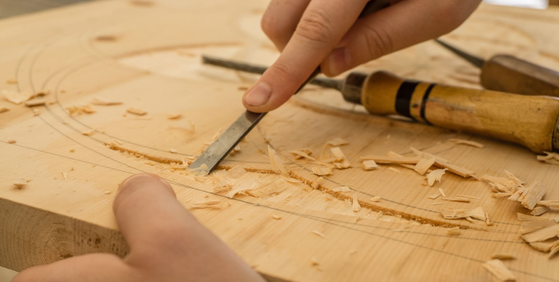
The single most important fact about Japanese woodblocks is the direction of the grain. Mokuhanga uses plank grain (ita-me) — boards cut along the length of the trunk, so the wood’s fibers run parallel to the carving surface. This allows large, continuous blocks and a smooth, sympathetic surface for the long flowing lines of a kimono or a wave.
This is the opposite of Western wood engraving, which uses end grain (koguchi): a board cut across the trunk, exposing the dense cross-section of the fibers. End grain is harder and supports extremely fine lines, but the blocks are small and the technique is suited to tight tonal detail rather than sweeping contour. The plank-grain tradition is a defining material choice, not an accident — it shaped the very look of Japanese prints.
The Block Is a Tool, Not the Artwork
It helps to remember that the wood is never the finished object; the paper impression is. A full-color print required a separate block for each color. The carver first cut the key block (sumi-ban), which carries the black outline and defines the composition. From proofs of that key block, the artist and carver mapped out additional color blocks (iro-ban), one for each hue. A modest print might use four or five blocks; an elaborate one, a dozen or more.
Because the surviving Edo-period blocks were working tools, relatively few remain in good condition today. The artwork that collectors buy is the printed sheet — which is exactly why the wood’s durability over a print run becomes a matter of value, not just craft.
The Woods Used in Japanese Woodblock Printing
No single wood does everything well. Carvers chose species by task: a hard, durable wood for the all-important outline, softer and more easily worked woods for color areas, and very dense woods where extreme precision was needed. The table below summarizes the main woods and their roles before we look at each in turn.
| Wood (English) | Japanese | Character | Typical role |
|---|---|---|---|
| Mountain (wild) cherry | Yamazakura | Hard, fine even grain, very durable | Key blocks; long editions; fine outlines |
| Katsura | Katsura | Medium-soft, even, easy to carve | Color blocks; broad areas |
| Magnolia | Hō (hoonoki) | Soft, smooth, fine to cut | Color blocks; carving practice |
| Boxwood | Tsuge | Very hard and dense, extremely fine | Tiny, highly detailed elements |
| Japanese lime / basswood | Shina | Soft, stable, even; usually plywood | Modern blocks; students; large surfaces |
Mountain Cherry (Yamazakura): The Classic Block
The prized traditional wood for Japanese printmaking is mountain cherry, or yamazakura — the wild cherry, not the ornamental flowering variety. Its appeal is a rare combination of hardness and a fine, even grain. Hardness lets a carved line hold its edge through hundreds or even thousands of impressions; the tight, uniform grain means the wood cuts cleanly in any direction without splintering or fighting the knife.
For these reasons cherry was the standard choice for the key block, where a worn or chipped line would ruin every print made from it. Blocks were typically cut and seasoned carefully, often quarter-sawn for stability, and a good board could serve a publisher for years. When you admire the confident, unbroken contour of an early Hokusai or Hiroshige impression, you are looking at the discipline of cherry wood as much as the carver’s hand.
Katsura, Magnolia, and Other Plank Woods
Cherry was relatively expensive and demanding to carve, so color blocks — which carry flat areas rather than the finest lines — were often cut from softer, friendlier woods. Two appear repeatedly in workshops. Katsura (Cercidiphyllum japonicum) is moderately soft with an even grain that takes broad color areas well and is forgiving under the chisel.
Magnolia, known as hō or hoonoki (Magnolia obovata), is softer still, with a smooth, fine, almost waxy surface that cuts beautifully — the same qualities that made it a traditional wood for knife handles and scabbards. It is a common wood for color blocks and for learning the craft. Using cheaper woods for color blocks and reserving cherry for the outline was a practical economy that kept prints affordable in the Edo marketplace.
Boxwood (Tsuge) for the Finest Detail
Where a design demanded exceptionally fine, dense detail — think of the individual hairs at a courtesan’s temple in a deluxe print — carvers could turn to boxwood (tsuge, Buxus). Boxwood is extremely hard and tight-grained, the same wood favored for combs and seals, and in cross-section it supports the kind of hairline cutting associated with European wood engraving. It was never the everyday plank for a full sheet, but it had a role wherever precision mattered most.
Shina Plywood and the Modern Workshop
The wood story does not end in the Edo period. Today many printmakers, students, and contemporary mokuhanga artists work on shina plywood — manufactured from Japanese lime or basswood (Tilia japonica). Plywood is dimensionally stable, inexpensive, available in large sheets, and resists the warping and cracking that can plague solid boards. Its soft, even face carves easily, though it does not hold the very finest lines as tenaciously as cherry.
For demanding work, some makers still prefer solid cherry, or use boards faced with a hardwood veneer over a stable plywood core — capturing cherry’s carving surface with plywood’s stability. Understanding this range matters for collectors of modern and contemporary prints: the choice of block is part of how a living artist controls line quality and edition size.
From Block to Print: Carving, Registration, and Wear
Knowing the woods is only half the picture; what the carver and printer do with them explains why two impressions from the same design can differ dramatically in quality and price. The process is exacting, and the wood is an active participant at every step.
Transferring and Carving the Design
The artist’s drawing was first made as a thin, semi-transparent sheet called a hanshita-e, which was pasted face-down onto the planed block and rubbed thin with oil so the lines showed through in reverse. The carver then cut along those lines with a knife (tō) held like a pen, and cleared the non-printing areas with chisels and gouges. The key block was carved first; its proofs guided the carving of each color block so every element would align.
Kentō: The Registration That Holds Everything Together
Printing a clean multicolor image depends on every sheet landing in exactly the same position on every block. Japanese printmaking solves this with kentō — registration marks carved directly into the wood: an L-shaped corner notch and a straight edge against which the printer seats each sheet. Cut into the same board as the image, the kentō ages with the block, and damage to these marks can make precise color registration impossible on later printings.
How Block Wear Changes the Print
Even durable cherry is not immortal. Across a long edition the carved ridges slowly round and thin, fine lines drop out, and boards can split along the grain. Printers and publishers sometimes recut damaged areas or replaced whole blocks, and on popular designs this happened repeatedly. The consequence for collectors is direct: early impressions, pulled while the block was crisp, show sharp, unbroken lines and richer detail, while later impressions look softer or show breaks where the wood cracked.
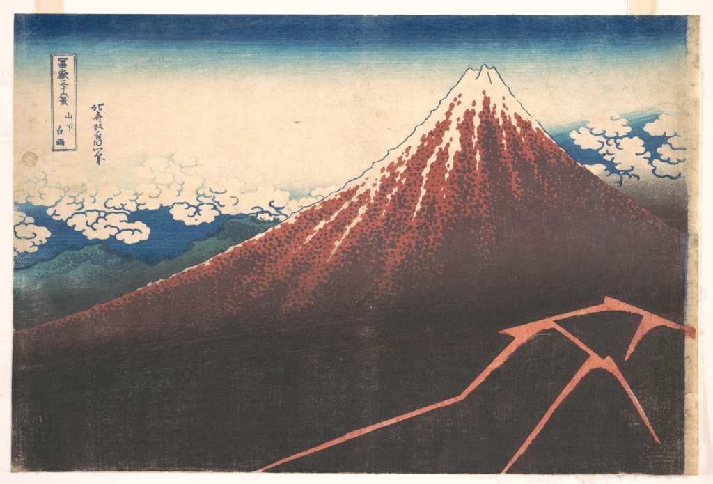
Hokusai’s “Great Wave” is the textbook case. With an estimated several thousand impressions printed over the design’s life and the key block eventually cracking, the condition and freshness of a given sheet — a function of how worn the wood was when it was printed — is central to how specialists rank it. The wood, in other words, is encoded in the print.
What the Wood Means for Collectors
Source: The Metropolitan Museum of Art(https://www.metmuseum.org/art/collection/search/36492)
For anyone buying ukiyo-e, the material facts above translate into a small number of practical questions: how early is this impression, what condition is the paper in, and how does this example compare with others of the same design. Because the block degraded over time, two prints of the same image can sit at very different price points.
Reading an Impression
Specialists assess freshness of line (an indicator of an early pull from an unworn block), strength and accuracy of color, and the state of the paper — fading, foxing, trimming, and backing all matter. Catalogue notes from major houses frequently describe whether an impression is early and well-preserved, language that points straight back to the condition of the wood at the moment of printing. For a collector, learning to read these cues is the difference between a routine sheet and an exceptional one.
Auction Benchmarks
The market for the finest impressions has risen sharply. In March 2023, Christie’s New York sold a single, exceptionally fine impression of Hokusai’s “Under the Wave off Kanagawa” (the “Great Wave”) for about USD 2.76 million (roughly ¥360 million) against an estimate of USD 500,000–700,000, a record for the print. The following year, in March 2024, Christie’s sold a complete set of the “Thirty-six Views of Mount Fuji” series for about USD 3.56 million, setting an auction record for the artist.
These headline figures are outliers reserved for the rarest, best-preserved material; ordinary impressions of common designs by the same artists trade for a tiny fraction of those sums. The broader pattern, visible across decades of public sales, is a steep, sustained climb in the value of top-quality Hokusai impressions — a reminder that condition and freshness, the legacy of the block, are what the market rewards.
| Print type | Typical market position |
|---|---|
| Record-level “Great Wave” impression | Multi-million USD (Christie’s, 2023) |
| Complete “Thirty-six Views of Mount Fuji” set | USD 3.56 million (Christie’s, 2024) |
| Standard impressions of common ukiyo-e designs | Hundreds to low tens of thousands USD, condition-dependent |
The same logic carries into the twentieth century. The shin-hanga (“new prints”) movement of artists such as Kawase Hasui and Yoshida Hiroshi, and the sōsaku-hanga (“creative prints”) of figures like Onchi Kōshirō and Munakata Shikō, all rest on the same woodblock craft, and here too lifetime impressions from fresh blocks are valued above later restrikes.
Woodblock Prints in the Contemporary Interior
Beyond the saleroom, woodblock prints have a long second life on the walls of homes and hospitality spaces, and the wood-and-paper nature of the medium carries real implications for how they should be displayed. A standard ōban sheet is intimate in scale — roughly 25 by 38 centimeters — so prints reward grouping, considered framing, and placement where a viewer can come close.
Because these are water-based pigments on washi paper, they are light-sensitive. Direct sun will fade the very indigos and reds that make a landscape sing, and humidity swings invite foxing and cockling. Sympathetic display means UV-filtering glazing, acid-free mounts, stable humidity, and a wall away from harsh daylight — the same conservation common sense that protects any work on paper, applied with a little extra care.
Aesthetically, the restrained palettes and seasonal subjects of Japanese prints — water, snow, blossom, mountain — settle naturally into calm, light-filled interiors and read beautifully against both warm timber and cool plaster. That sensibility, the marriage of natural materials and seasonal feeling, is precisely what links the woodblock tradition to the wider world of Japanese painting.
If learning how cherry blocks and washi shape a print has deepened your interest, the same appreciation for natural pigments, paper, and seasonal subject runs directly into Nihonga — Japanese-style painting built on mineral pigments and traditional supports — which offers a natural way to bring that lineage into a real room.
Discover Nihonga for Contemporary Spaces
Shop carefully selected Nihonga,
curated by experienced Japanese art dealers
for homes and commercial spaces worldwide.