
Japandi Art
How to Choose a Japandi Dining Table: A Buyer’s Guide


The Japandi dining table has become one of the most requested pieces in contemporary interiors, and also one of the most misunderstood. The term itself is a recent coinage from design media — a compression of “Japanese” and “Scandinavian” — but the affinity it describes is older and more substantial than the label suggests. Both traditions arrived at low-ornament, high-craft furniture through similar pressures: limited materials, long winters or humid summers, and a cultural preference for objects that improve rather than deteriorate with use.
For a dining table, that inheritance matters more than it does for almost any other piece of furniture. A dining table is the largest horizontal surface in most homes, the most heavily used, and the piece around which a room’s entire circulation and lighting scheme is organized. Getting it wrong is expensive and difficult to undo.
This guide covers what actually distinguishes a Japandi dining table from generic minimalist furniture, how to read materials and joinery, how to size the table for the room rather than the showroom, what the realistic price bands look like, and — the question that arrives last and matters more than most buyers expect — what belongs on the wall behind it.
What a Japandi Dining Table Actually Is
Stripped of marketing language, a Japandi dining table is a solid-wood table with a quiet profile, honest construction, a low-sheen finish, and proportions that read as light rather than imposing. It is not a style so much as a set of decisions, and those decisions descend from two distinct design cultures that converged repeatedly across the twentieth century.
The Japanese Side: Ma, Shibui, and the Mingei Inheritance
Two Japanese aesthetic concepts do most of the work here. Ma refers to negative space — the interval, the pause, the empty area that gives the occupied area its meaning. In furniture terms, ma is why a Japandi dining room does not fill its corners, and why the table’s base is designed to let the floor read through it. Shibui describes a restrained, understated beauty that reveals itself slowly, the opposite of immediate visual impact.
The practical transmission route into modern furniture was the mingei (folk craft) movement, founded in the mid-1920s by the philosopher Yanagi Sōetsu together with the potters Hamada Shōji and Kawai Kanjirō. Mingei argued for the beauty of anonymous, functional, handmade objects made for daily use — an argument that landed directly in the same intellectual territory Scandinavian designers were occupying at the time. Yanagi Sōetsu’s son, the industrial designer Sōri Yanagi, carried that thinking into modern Japanese product and furniture design after the war.
The Scandinavian Side: Function, Warmth, and Restraint
Danish and Swedish furniture design of the 1940s through 1960s pursued a comparable goal by a different route: rigorous cabinetmaking, humane proportions, and materials left legible. Designers including Hans J. Wegner, Børge Mogensen, and Finn Juhl worked in oak, teak, and ash with visible joints and oil finishes rather than high-gloss lacquer.
The cross-pollination was not accidental. The French designer Charlotte Perriand spent the early 1940s in Japan as an advisor on industrial design, working with local craftsmen and materials — bamboo, wood, woven fiber — and her period there is one of the best-documented moments of direct exchange between European modernism and Japanese craft. In ceramics, the friendship between Hamada Shōji and the British potter Bernard Leach carried mingei thinking into Northern European studio craft from the 1920s onward.
Where the Two Traditions Genuinely Overlap
The overlap is narrower than the trend suggests, which is useful to know when shopping. Both traditions favor solid timber over veneer, matte or satin finishes over gloss, warm neutral palettes, and joinery that is either visible and celebrated or invisible and precise — never disguised with filler and paint.
Where they diverge: Scandinavian tables tend to sit at standard Western dining height with generous apron depth, while Japanese domestic tradition historically favored floor-level tables such as the chabudai. Japanese joinery tends toward more complex interlocking systems; Danish work often uses refined mortise-and-tenon with a sculptural leg-to-top transition. A good Japandi dining table resolves this honestly rather than pretending the two are identical.
Materials, Joinery, and Finishes
Material choice determines almost everything about how a dining table ages — its color in ten years, its resistance to the water rings and cutlery marks that are inevitable in real use, and whether it can be refinished or must be replaced. This is where price differences are most defensible and where the cheapest options fail most visibly.
Woods and Their Character
White oak is the default for good reason: hard, dimensionally stable, with a straight grain that reads calm, and it takes oil finishes beautifully. Ash is lighter in tone and slightly more open-grained. Walnut brings warmth and depth but darkens the room’s overall value. Among Japanese timbers, keyaki (Japanese zelkova) is prized for dramatic figure and hardness and appears in high-end craft furniture; hinoki (Japanese cypress) is aromatic, pale, and traditionally associated with architecture and bathing rather than heavy-use tabletops; sugi (Japanese cedar) is soft and best used where its grain can be expressed rather than where it will be scratched.
Solid timber is not automatically superior to engineered construction for very large tops. A wide single-slab top in an environment with swinging humidity will cup or check. Reputable makers address this with breadboard ends, floating fasteners, or a well-made solid-wood panel glued up from narrower boards with alternating grain orientation.
| Wood | Tone | Durability for dining use | Notes |
|---|---|---|---|
| White oak | Pale honey to greige | High | The safest default; refinishes well |
| Ash | Very pale, cool | High | Lightest visual weight; pronounced grain |
| Walnut | Mid to dark brown | High | Lightens slightly with UV exposure over years |
| Keyaki (zelkova) | Warm reddish brown | High | Strong figure; associated with Japanese craft furniture |
| Hinoki (cypress) | Pale cream | Moderate | Soft; marks readily under daily dining use |
| Sugi (cedar) | Pale to reddish | Low to moderate | Best as an accent or with yakisugi treatment |
Joinery and Base Construction
Japanese cabinetmaking, known broadly as sashimono, developed regional traditions — Edo sashimono in the shogunal capital, Kyō sashimono in Kyoto — built around interlocking wooden joints that use little or no metal hardware. The relevant point for a buyer is not that a table must use traditional joints, but that the joint strategy should be visible and intentional.
Inspect the leg-to-apron connection and the underside. A well-made table shows tight mortise-and-tenon or dowel-and-stretcher construction, with hardware that is either absent or deliberately chosen. Tables that rely on a steel plate and four bolt-on legs will loosen within a few years of being pushed against by chairs, and many cannot be tightened permanently.
Trestle and A-frame bases suit Japandi rooms because they push structure to the ends and leave the middle open, which reads lighter and improves seating flexibility. Four-leg tables with a full perimeter apron are more rigid but impose fixed seat positions and reduce knee clearance for taller diners.
Finishes: Oil, Urushi, and Yakisugi
Hardwax oil and penetrating oil finishes dominate this category. They sit in the wood rather than on it, produce a matte surface, show the grain honestly, and can be spot-repaired by the owner — a genuine advantage over film finishes, which must be stripped and redone entirely. The trade-off is that oil finishes require periodic reapplication and are more vulnerable to wine, oil, and citrus if spills are left to sit.
Urushi is natural lacquer derived from the sap of the lacquer tree, applied in many thin layers and cured in humid conditions. It is extraordinarily durable and water-resistant, and it is expensive — a genuine urushi tabletop is a commissioned object, not a catalogue purchase. Most “lacquer” furniture sold internationally uses synthetic coatings; the distinction is worth confirming before paying a premium.
Yakisugi (also marketed as shou sugi ban) is the Japanese technique of charring cedar to produce a carbonized, weather-resistant surface. It is an exterior siding tradition. On a dining table it appears occasionally on bases or aprons, rarely on a top, since the charred layer is not appropriate for a surface that contacts food and forearms.
Getting the Proportions Right
More Japandi dining rooms fail on dimension than on style. The aesthetic depends on visible floor and uncluttered circulation, which means an oversized table destroys the effect even if the table itself is beautiful. Measure the room before shortlisting anything.
Height, Width, and Seat Clearance
Standard dining height is 71–76 cm (28–30 in). Japandi tables often sit at the lower end of that range, which reads calmer but requires matching chair seat heights of roughly 43–46 cm (17–18 in). Confirm that at least 25–30 cm (10–12 in) of clearance exists between the chair seat and the underside of the tabletop or apron.
Allow 60 cm (24 in) of table edge per diner as a working minimum and 70–76 cm (28–30 in) for comfort. Table depth of 90–100 cm (36–40 in) allows serving dishes down the center without crowding place settings; narrower tables of 75–85 cm suit smaller apartments and read more elegantly but limit center-of-table service.
| Seats | Rectangular size | Round diameter | Minimum room size |
|---|---|---|---|
| 4 | 120 × 80 cm (47 × 32 in) | 100–110 cm (40–43 in) | 300 × 260 cm |
| 6 | 180 × 90 cm (71 × 36 in) | 130–140 cm (51–55 in) | 360 × 270 cm |
| 8 | 220 × 95 cm (87 × 37 in) | 150–160 cm (59–63 in) | 400 × 280 cm |
| 10 | 280 × 100 cm (110 × 40 in) | 180 cm (71 in) | 460 × 290 cm |
Circulation and Room Planning
Leave a minimum of 90 cm (36 in) between the table edge and any wall or fixed furniture — this is the space required to pull a chair out and sit down. Where people must walk behind seated diners, increase that to 110–120 cm (44–48 in). In open-plan apartments, the main circulation route should not pass within 90 cm of an occupied chair back.
Pendant lighting sits 75–90 cm (30–36 in) above the tabletop. Over a long table, two or three smaller pendants usually read better in a Japandi scheme than one large fixture, because the repetition creates rhythm without visual mass. Keep the fixture width to roughly one-half to two-thirds of the table width.
Shape: Rectangle, Round, or Oval
Rectangles suit long rooms and galley-plan apartments and are the most space-efficient per diner. Round tables improve conversation, eliminate the problem of a hard corner in a tight circulation path, and pair well with the centered, symmetrical compositions common in Japanese interiors — but they consume more floor area per seat and become unwieldy above 150 cm diameter. Oval and soft-cornered rectangles are the practical compromise and are increasingly the default in well-resolved Japandi rooms.
Price Bands and Where the Value Sits
Dining tables in this category span roughly two orders of magnitude, and the price differences are mostly explicable. Understanding what you are paying for prevents both overspending on branding and underspending on construction that will fail.
What Drives Cost
Four variables account for most of the spread: solid timber versus veneer over engineered core; joinery method and whether the piece is machine-assembled or hand-fitted; the grade and width of the boards, since wide, clear, straight-grained stock is scarce and priced accordingly; and labor geography. A hand-fitted table from a small Japanese or European workshop carries weeks of skilled labor that a factory piece does not.
| Band | Typical price (USD) | What you get |
|---|---|---|
| Entry | $500–1,500 | Veneer or solid rubberwood/acacia; bolt-on legs; factory finish |
| Mid | $1,500–4,500 | Solid oak or ash; sound joinery; oil finish; standard sizes |
| Upper mid | $4,500–12,000 | Designer or small-workshop production; selected stock; custom sizing |
| Bespoke / craft | $12,000–40,000+ | Hand-fitted joinery, rare timber, commissioned dimensions, urushi options |
Vintage and Collectible Options
Mid-century Danish dining tables in teak and oak remain the strongest value proposition for buyers who want genuine craft at moderate cost, and they sit comfortably in a Japandi scheme. Production tables by well-known Danish designers regularly appear at European and North American design auctions in the low-to-mid four figures, with condition, provenance, and original finish driving the spread.
At the top of the market sits the work of George Nakashima, the Japanese-American woodworker whose Pennsylvania studio produced free-edge slab tables from the 1940s onward and whose practice is the clearest single embodiment of this entire aesthetic convergence. Nakashima dining tables have become established lots at specialist design sales at houses including Rago, Wright, and Phillips, with results typically in the tens of thousands of dollars and exceptional large-slab or documented commissioned examples reaching substantially higher. Buyers in this range should insist on studio documentation, as the workshop’s records are detailed and attribution without them is risky.
Specifying for Hospitality and Contract Use
Commercial buyers face different constraints. Oil finishes that a homeowner can maintain are impractical in a restaurant where surfaces are sanitized many times daily; a catalyzed or conversion finish is usually required, with the aesthetic cost of slightly more surface sheen. Confirm that the base meets local stability and fire-rating requirements, that timber is sourced with chain-of-custody certification where the project requires it, and that the maker can supply replacement tops from matched stock five years later. Contract-grade pricing typically runs 20–40 percent above equivalent residential pieces for these reasons.
The Wall Behind the Table: Art in a Japandi Dining Room
A Japandi dining room is defined by subtraction, which places unusual weight on the few elements that remain. Once the table, chairs, and lighting are resolved, the wall behind or beside the table becomes the only remaining opportunity for color, depth, and narrative — and the choice made there determines whether the room reads as considered or as merely empty.
Why Nihonga Suits This Room
Nihonga is Japanese-style painting, a term that emerged in the Meiji period (1868–1912) to distinguish work made with traditional Japanese materials and methods from Western-style oil painting. Nihonga is built from iwa-enogu — mineral pigments ground from stones such as azurite, malachite, and cinnabar — bound with nikawa, an animal-hide glue, and applied to washi paper or silk. Gofun, a white made from calcined shell, provides grounds and highlights, and gold or silver leaf is frequently laid beneath or within the image.
The reason this material system works so well above a wooden dining table is optical. Mineral pigments are crushed rather than dissolved, so the particles retain facets that scatter light. The surface has granular depth rather than flat saturation, and its appearance shifts with the light throughout the day — bright and mineral under morning light, warm and reflective under evening pendants. Against an oiled oak top that also changes with the light, the two surfaces converse rather than compete.
Historically, this is the same logic that produced the gold-ground screens of the Rinpa tradition associated with Tawaraya Sōtatsu and Ogata Kōrin, which were designed for dim interiors lit by low, warm light. Modern masters including Yokoyama Taikan, Uemura Shōen, and Higashiyama Kaii extended the vocabulary into the twentieth century, and their work can be studied at institutions such as the Yamatane Museum of Art in Tokyo, which specializes in Nihonga, and the Adachi Museum of Art in Shimane, known for its Taikan holdings. Among contemporary painters, Hiroshi Senju’s waterfall works — made with natural pigments on washi — have become one of the most visible demonstrations that this material tradition operates at architectural scale in modern spaces.
Scale, Height, and Format
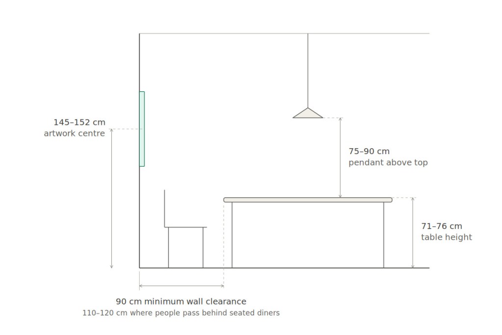
Scale is where most dining-room art placement fails. A useful working rule is that a single work hung above a dining table or sideboard should measure roughly two-thirds to three-quarters of the width of the furniture below it. A 180 cm table wants a work of approximately 120–135 cm width, or a grouped arrangement reaching that combined span.
Hanging height depends on whether furniture sits beneath. Against an open wall, center the work at approximately 145–152 cm (57–60 in) from the floor. Above a sideboard or console, leave 20–30 cm (8–12 in) between the furniture top and the bottom edge of the work so the two read as a single composition rather than as two unrelated objects.
Format matters as much as size. A kakejiku (hanging scroll) is vertical, seasonal by tradition, and intended to be rotated and rested — a good fit for a narrow wall segment or an alcove, and a genuinely practical option for renters since it requires only a single fixing point. A byōbu (folding screen) is horizontal, free-standing, and can define the edge of an open-plan dining zone without a wall. Framed panel works, or gaku, are the most straightforward option for a long wall behind a rectangular table, and glazing simplifies the conservation question considerably.
Light, Humidity, and Conservation in a Dining Space
A dining room is a demanding environment for works on paper and silk. Three factors need managing, none of them prohibitive.
Light first. Museums generally display works on paper at around 50 lux with ultraviolet filtration, and while a home cannot replicate that, the principles transfer: avoid direct sunlight entirely, keep the work off walls that receive afternoon sun, use UV-filtering glazing on framed pieces, and choose warm, low-UV LED lighting rather than halogen. Mineral pigments and metal leaf are comparatively stable, but organic colorants, dyed silk, and paper supports are not.
Humidity second. The nikawa binder and washi or silk support respond to moisture, and repeated swings cause cockling and, over time, flaking of the pigment layer. A stable range of roughly 45–55 percent relative humidity is the target. Avoid hanging directly above a radiator, beneath an air-conditioning outlet, or on an exterior wall prone to condensation.
Cooking atmosphere third. In open-plan kitchens, aerosolized cooking oil migrates and deposits on unglazed surfaces, where it attracts particulates and becomes difficult to remove without professional intervention. In a genuinely open kitchen-dining space, favor glazed framed works over unglazed scrolls, or place the scroll on the wall furthest from the range. A traditional practice worth adopting regardless: scrolls are rolled and stored between showings and rotated seasonally, which limits cumulative light and atmospheric exposure and also keeps the room from becoming visually static.
Bringing the Room Together
A Japandi dining table is a long-term purchase, and the decisions around it compound. Choose solid timber and honest joinery over surface styling; size the table to the circulation the room can actually support rather than to the seat count you aspire to; accept an oil finish and the light maintenance it requires, or specify a harder finish knowingly for commercial use; and treat the wall behind the table as part of the same composition rather than an afterthought handled later.
That last decision is the one that most often distinguishes a room that photographs well from a room that holds up over years of daily use. The mineral surfaces, restrained palettes, and seasonal logic of Nihonga were developed for exactly this kind of interior — warm-lit, wood-framed, quiet — and a single well-chosen painting or scroll will do more for a Japandi dining room than any additional object in it.
If you are working out what belongs above your own table, it is worth spending time with actual works rather than mood boards, looking at how mineral pigment and gold leaf behave at the scale and format your wall can take.
Discover Nihonga for Contemporary Spaces
Shop carefully selected Nihonga,
curated by experienced Japanese art dealers
for homes and commercial spaces worldwide.