
Nihonga & Japanese Painting
The Great Wave: Hokusai’s Iconic Japanese Painting
- The Great Wave: Painting or Print? Hokusai and the Making of an Icon
- Reading the Composition: Wave, Boats, Fuji and Prussian Blue
- The Great Wave on the Market: Records, Price Ranges and Price Drivers
- Living with the Great Wave: Display, Conservation and Scale
- Conclusion: From an Edo Print to a Wall of Your Own
- Discover Nihonga for Contemporary Spaces
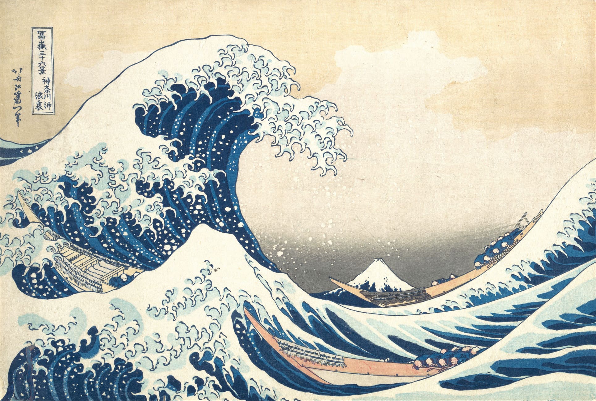
The work most people search for as the “Japanese painting The Great Wave” is actually a woodblock print: Katsushika Hokusai’s Under the Wave off Kanagawa (Kanagawa oki nami ura), designed around 1830–32 and printed in multiple impressions for the Edo publisher Nishimuraya Yohachi. That difference matters. It explains why the image is in dozens of museums at once, why one impression can sell for millions of dollars while another sells for a fraction of that, and why collectors talk about “impressions” rather than “the original.”
This guide is for collectors, interior designers, art advisors and serious enthusiasts. It covers Hokusai’s life, how the print was made, how to read its composition, what verified auction results reveal about the market, and how to display a light-sensitive work on paper in a real home or hospitality space. Along the way it contrasts ukiyo-e with Nihonga, the Japanese-style painting tradition that grew up after the Meiji Restoration and is still practiced today.
The Great Wave: Painting or Print? Hokusai and the Making of an Icon
The Great Wave is a nishiki-e (“brocade picture”), a full-color woodblock print. It belongs to the broad genre of ukiyo-e (“pictures of the floating world”), the popular prints and paintings of the Edo period (1603–1868), when Japan was governed by the Tokugawa shogunate from Edo, present-day Tokyo. Ukiyo-e artists did paint, and Hokusai was a superb painter, but this image was made to be reproduced and sold cheaply to a mass urban audience.
Calling it a painting is understandable. The design has the authority of a painted masterpiece, and to most viewers the difference between brush on silk and ink pressed from a carved block is invisible. For a buyer, though, it is the first thing to understand: every Great Wave on the market is one impression among many. Its value depends on when it was printed and how well it has survived.
Katsushika Hokusai: A Life in Many Names (1760–1849)
Hokusai was born in 1760 in the Honjo district of Edo, in the Katsushika area east of the Sumida River, which gave him the surname he later used. He died in 1849, aged about 88 by Japanese reckoning, reportedly still wishing for more years to perfect his art. Over a career of roughly seventy years he produced paintings, book illustrations, printed manuals and single-sheet prints, and he used more than thirty art names.
The main names mark the phases of his career. As Shunrō, from 1779, he trained in the Katsukawa school under Katsukawa Shunshō and designed actor prints. As Sōri, in the mid-1790s, he produced refined surimono (privately commissioned prints) and paintings. “Hokusai” came into use around 1798. Gakyōjin (“man mad about painting”) appears in the early 1800s. Iitsu (“one year old again”) dates from 1820 and is the name signed on the Great Wave. Gakyō Rōjin Manji (“old man mad about painting”) appears from the mid-1830s. Today the Sumida Hokusai Museum, which opened in 2016 near his birthplace, is the main institution devoted to his work in Japan.
The Great Wave was made when Hokusai was about seventy, after a period of personal and financial difficulty. That timing matters. The print is not a young artist’s breakthrough but the work of a master who had spent decades studying perspective, natural forms and the expressive power of line. His printed sketchbooks, the Hokusai Manga (published from 1814), show the same restless observation.
Thirty-Six Views of Mount Fuji and the Publisher Eijudō
The Great Wave is part of Fugaku Sanjūrokkei (Thirty-Six Views of Mount Fuji), published by Nishimuraya Yohachi under the trade name Eijudō. The series was advertised in 1831, and museums generally date the Great Wave to about 1830–32. The Metropolitan Museum of Art gives “ca. 1830–32,” while the British Museum and others often use 1831. The series was popular enough that ten more designs were added, for a total of forty-six.
The prints are in the horizontal ōban format, the standard large sheet of the period, about 25.7 × 37.9 cm (roughly 10 × 15 inches). The title cartouche at upper left reads “Fugaku sanjūrokkei / Kanagawa oki nami ura.” The signature beside it reads “Hokusai aratame Iitsu hitsu,” meaning “from the brush of Iitsu, formerly Hokusai.” Landscape prints were a relatively new commercial category at the time, and the series helped turn them into a major genre. Utagawa Hiroshige’s Fifty-Three Stations of the Tōkaidō followed within a few years.
Designer, Carver, Printer: How a Nishiki-e Was Made
Edo woodblock prints were made collaboratively, and the publisher (hanmoto) financed and coordinated the work. The designer (eshi) drew the image in ink on thin paper. A carver (horishi) pasted that drawing face-down on a block of mountain cherry wood and carved through it, which destroyed the original drawing, leaving a raised keyblock of black outlines. Separate color blocks were then carved, one for each color area. A printer (surishi) brushed water-based pigment onto each block and rubbed dampened washi (Japanese mulberry-fiber paper) against it with a baren, a flat disc-shaped pad, aligning each color with registration marks called kentō.
This system explains why impressions differ. Early impressions were printed from freshly carved blocks under the close supervision of the publisher and, sometimes, the designer. As the edition went on, blocks wore down, cracked and were sometimes repaired, and printers simplified the color work. The keyblock is ink, but most of the colors were organic or imported pigments that react to light, which is essential for conservation.
Reading the Composition: Wave, Boats, Fuji and Prussian Blue
The Great Wave works through contrast. A huge wave curls across the left of the sheet, its foam breaking into claw-like fingers, while Mount Fuji sits small and still in the lower center, framed by the hollow of the wave. Movement meets stillness, and the momentary meets the permanent. The design also makes use of the viewer’s habit of reading right to left, as Japanese texts are read. From that direction the wave rises toward the boats with even more menace.
Scholars generally describe the wave as a large offshore swell rather than a tsunami, despite common usage. The title’s “oki” means the open sea off the coast, and Kanagawa was a post town on the Tōkaidō road, on the bay south of Edo.
The Oshiokuri-bune and the Low Mountain

Source:Wikipedia(https://ja.wikipedia.org/wiki/%E7%A5%9E%E5%A5%88%E5%B7%9D%E6%B2%96%E6%B5%AA%E8%A3%8F#)
The three long boats are oshiokuri-bune, fast rowing boats that carried fresh fish from the outer fishing grounds into Edo markets. Their crews crouch low, gripping their oars, and are small compared with the water. The boats are not sinking. They are riding the swell, which gives the image its tension between danger and human skill.
Hokusai placed Fuji very low and made it tiny compared with the foreground. This dramatic shift in scale owes something to Western perspective, which reached Japan through Dutch engravings and through uki-e (“floating pictures”), Japanese prints that used vanishing-point perspective. Hokusai had experimented with Western-style shading and viewpoints for decades, and earlier wave designs from about 1800 and 1805 show him working toward this composition. Christine Guth, in Hokusai’s Great Wave: Biography of a Global Icon (2015), argues that this blend of Japanese and European ways of seeing helps explain why the image has traveled so easily across cultures.
Bero-ai: The Imported Blue That Changed Ukiyo-e
The deep blue of the Great Wave is Prussian blue, known in Japan as bero-ai or berorin-ai, a name derived from “Berlin.” This synthetic pigment was discovered in Berlin in the early eighteenth century. It reached Japan through Dutch and Chinese trade and became cheap enough for mass printing around 1829–30, when imports increased. Before then, Japanese printers relied on plant blues such as dayflower and indigo, which were either fugitive or hard to print in smooth, strong gradations.
Prussian blue allowed rich, stable blues and subtle tonal gradations (bokashi), and publishers quickly exploited the fashion. Eijudō’s series was among the first major landscape projects to use it prominently, and some early designs in the series were printed largely in blue (aizuri-e, “blue-printed pictures”). Prussian blue is more stable than the older plant blues, but it is not immune to damage. It can shift or fade under strong light, especially alongside fugitive pinks and yellows, so color freshness is a key measure of value.
From Edo to the World: Japonisme and the Modern Icon
After Japan reopened to international trade in the 1850s, ukiyo-e flooded into Europe and fed Japonisme, the Western enthusiasm for Japanese art and design. Hokusai became one of its central figures. In a September 1888 letter from Arles to his brother Theo, Vincent van Gogh wrote about Hokusai’s wave, saying the waves were like claws and that the boat is caught in them. Claude Monet collected Japanese prints at Giverny, including works by Hokusai, and the collection can still be seen in his house.
Claude Debussy reportedly kept the print in his study, and the cover of the first edition of his orchestral work La Mer (1905) reproduced a detail of the wave. Camille Claudel’s sculpture The Wave (La Vague), begun in the late 1890s in onyx and bronze, is widely read as a response to Hokusai’s design. In the twentieth and twenty-first centuries the image moved into advertising, fashion and digital culture. The standard “water wave” emoji, added to Unicode in 2010, is often rendered by platforms in a form that echoes Hokusai.
Japan itself has made the print a national emblem. Japanese passports redesigned from 2020 carry images from Thirty-Six Views of Mount Fuji on their visa pages. The Bank of Japan’s new 1,000-yen note, issued from 3 July 2024, puts the Great Wave on the reverse and the bacteriologist Kitasato Shibasaburō on the front. Major impressions are held by the Metropolitan Museum of Art (H. O. Havemeyer Collection), the British Museum, the Museum of Fine Arts Boston, the Art Institute of Chicago, the Library of Congress, the Tokyo National Museum and the Sumida Hokusai Museum, among others. The British Museum’s 2017 exhibition Hokusai: Beyond the Great Wave, curated by Timothy Clark, placed the print within the late decades of Hokusai’s career.
The Great Wave on the Market: Records, Price Ranges and Price Drivers
The Great Wave has become one of the most valuable Japanese prints at auction. The rise has been fast: in the early 2000s good impressions often sold in the tens to low hundreds of thousands of dollars, and record prices have since passed $2 million. The underlying supply is limited. Commonly cited estimates suggest the original print run reached several thousand impressions, and figures of about 5,000 to 8,000 appear in auction-house and press coverage. Only about 100 impressions are generally thought to survive, many of them permanently in museums.
Notable Auction Results
The table below lists results that are widely reported by the auction houses and art-market press. Buyers should check final figures against the auction house’s own published lot records, since prices include buyer’s premium and exchange rates change.
| Sale | Estimate | Price realized (incl. premium) | Significance |
|---|---|---|---|
| Christie’s New York, Japanese and Korean Art, 21 March 2023 | approx. $500,000–700,000 | $2,760,000 (about ¥360 million at the 2023 rate) | Widely reported as the world auction record for the print |
| Christie’s New York, Japanese and Korean Art, March 2021 | approx. $150,000–200,000 | $1,590,000 (about ¥173 million) | Record at the time; roughly ten times the high estimate |
| Christie’s, Sotheby’s and Bonhams sales, New York, London and Paris, 2015–2024 | Varies | Commonly from the low hundreds of thousands to about $1 million or more, depending on impression and condition | Shows the depth of the market beyond record lots |
The 2023 result is important because it was not an isolated jump. It confirmed a price level that the 2021 sale had signaled. Both results also show that a strong impression in good condition can far exceed a conservative estimate when several institutions and private collectors compete.
Price Ranges by Category
The ranges below summarize patterns in public auction results and specialist dealer pricing from roughly 2015 to 2025. They are indicative, not appraisals.
| Category | Typical range (USD) | Notes |
|---|---|---|
| Early Edo-period impression, strong color, good condition | $1,000,000–2,800,000+ | Few reach the market; record territory |
| Good Edo-period impression, some wear or fading | $250,000–1,000,000 | Core of recent major-house sales |
| Late Edo-period impression or condition-compromised sheet (trimmed, faded, repaired, backed) | $50,000–250,000 | Wide variation; condition reports are decisive |
| Meiji, Taishō or early Shōwa recarvings and reproductions | $300–5,000 | Higher for well-documented early 20th-century editions |
| Contemporary hand-printed reproductions (e.g., Adachi Institute) | $150–600 (about ¥20,000–90,000) | New, hand-carved and hand-printed recreations |
| Offset posters and giclée prints | $15–150 | Decorative; no collectible value |
What Moves the Price
Five factors determine most of the value: impression quality, color, condition, provenance and market timing. Impression quality usually matters most, because it cannot be restored.
Early vs. Late Impressions
Early impressions have crisp, continuous keyblock lines, including the fine outlines of the spray and the wave’s “claws.” The border of the title cartouche is intact, and the tonal gradations in the sky and water are subtle and carefully printed. Specialists, including Timothy Clark in the research behind the 2017 British Museum exhibition, have traced how the blocks deteriorated. Later impressions show breaks in the keyblock lines, cracks and losses in the cartouche frame, and simpler color printing. Some early impressions have a delicate pinkish or grayish tone in the sky, and some lines, such as clouds, are weaker or missing in later states.
No single feature settles the question. Serious buyers compare a candidate sheet side by side with well-documented museum impressions, many of which have high-resolution images online. A specialist condition report from a major auction house or an established ukiyo-e dealer should describe the impression explicitly.
Condition, Color and Provenance
Condition problems include fading (especially of the blue gradations and any pink tones), trimmed margins, wormholes, stains, toning, thinning of the paper, creases, repairs and old backing sheets. Full backing can hide damage and reduce value. Color that is fresh and unfaded commands a large premium, because light damage cannot be reversed. Provenance from a notable collection, such as a documented early Western collection or a published Japanese one, adds confidence and value. Collector’s seals stamped on the sheet can help trace ownership, though seals can also be faked.
Originals, Recarvings and Reproductions: Authentication Basics
Because the image is so famous, most Great Waves offered outside major auctions are reproductions. From the Meiji period (1868–1912) onward, Japanese publishers recarved new blocks from original prints. In the early twentieth century, publishers such as Takamizawa Enji produced reproductions of classic ukiyo-e, some of which were artificially aged or confusing enough to deceive buyers. The Adachi Institute of Woodblock Prints, founded in 1928, still makes carefully hand-carved and hand-printed recreations, which are honest products sold as reproductions.
Warning signs include paper that is too white or too regular, a publisher’s or carver’s mark added in the margin (as modern reproductions often have), uniform synthetic colors, lines that are too even or too thick, and dimensions that do not match the ōban format. Under magnification, a real woodblock impression shows pigment pressed into the paper fibers and the texture of the baren. Offset prints show dot patterns. For any serious purchase, buy through a major auction house or an established specialist with a clear return policy, and request a written condition report.
Living with the Great Wave: Display, Conservation and Scale
Owning an Edo-period impression means taking on the duty of care that museums follow. The paper and many of the pigments are light-sensitive, and damage accumulates. For designers and hospitality buyers, the practical question is often whether to display an original at all, or whether a high-quality reproduction or a different medium better suits the space.
Light, Humidity and Rotation
Museums typically display Japanese prints at about 50 lux or less, well below normal room lighting, and limit exhibition to a few weeks or months before resting the print in dark storage for years. Many institutions rotate their Great Wave impressions for this reason. At home, that means no direct sunlight, UV-filtering glazing (acrylic or laminated glass), low-UV LED lighting, and ideally rotating the original with a facsimile.
Stable relative humidity of about 45–55% and moderate temperature prevent cockling, mold and foxing. Framing should use acid-free museum board, hinges of Japanese paper attached with wheat-starch paste, and a spacer that keeps the print away from the glazing. Bathrooms, kitchens, fireplaces, external walls and lobbies with direct sun are poor choices for any original work on paper.
How an Ōban Print Reads in a Room
At about 26 × 38 cm, the Great Wave is small. In a study, a hallway or beside a reading chair, where people see it from one or two meters away, it works well and rewards close looking. On a large living-room wall or in a hotel lobby, a single sheet can disappear. Designers usually either enlarge it with a generous mat and frame, group it with other prints, or place it in intimate zones such as an alcove, a corridor or a guest-room vignette.
The palette of Prussian blue, pale buff and white works with many interiors, from Japanese minimalism to coastal and mid-century schemes. Its strong diagonal motion also means it tends to dominate a small wall, so it needs clear space around it.
Ukiyo-e and Nihonga: Different Formats for Different Spaces
Nihonga (“Japanese-style painting”) emerged in the Meiji period, from the 1880s, when artists and critics such as Okakura Kakuzō (Tenshin), with Ernest Fenollosa, defined a modern painting tradition distinct from Western oil painting (yōga). Nihonga artists grind mineral pigments called iwa-enogu from stones such as malachite and azurite, bind them with nikawa (animal-hide glue) and apply them to washi or silk. They often use gofun (white made from shell) and gold or silver leaf (kinpaku, ginpaku). Leading early figures included Yokoyama Taikan and Hishida Shunsō.
The practical difference from a woodblock print is that a Nihonga work is unique and made directly by the artist’s hand, and it can be much larger. Formats include byōbu (folding screens), kakejiku (hanging scrolls) and framed panels, which can hold a lobby wall or a dining room in a way a single ōban print cannot. The granular mineral surface catches light and changes with viewing angle, which gives presence in large rooms. Water remains a strong theme: Hiroshi Senju’s waterfall paintings, made with mineral pigments on washi, show how Nihonga can bring the energy associated with Hokusai’s wave into architectural scale. Nihonga is still a work on paper or silk, however. It needs moderate light, stable humidity and protection from direct sun, though large panels are usually less fragile in practice than a two-hundred-year-old print.
Conclusion: From an Edo Print to a Wall of Your Own
The “Japanese painting The Great Wave” is best understood as a woodblock print: a collaboration between Hokusai, Eijudō’s carvers and printers, and a newly imported blue. Its market is driven by scarcity, impression quality and condition, with records reaching $2.76 million at Christie’s New York in 2023. For most rooms, the most sensible way to honor the image is to understand it, see it in museums, and choose carefully between an original impression, a well-made reproduction or a different kind of Japanese art.
If what draws you to the Great Wave is the way Japanese art can hold the energy of water and landscape in a room, a Nihonga painting, unique, hand-painted and made at a scale suited to real walls, is a natural next place to look.
Discover Nihonga for Contemporary Spaces
Shop carefully selected Nihonga,
curated by experienced Japanese art dealers
for homes and commercial spaces worldwide.