
Japandi Art
How to Choose a Japandi Floor Lamp: A Practical Guide
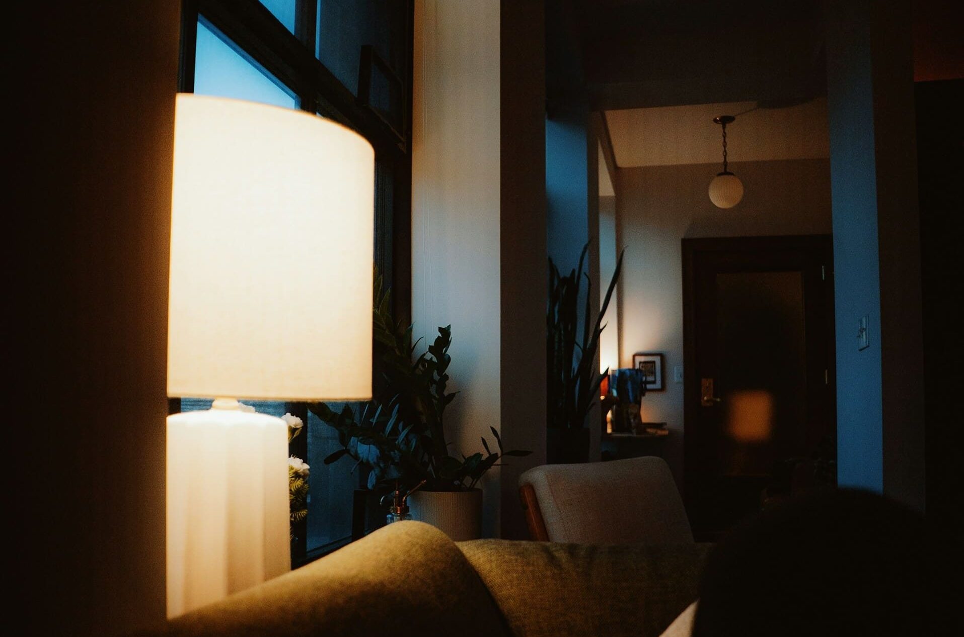
The Japandi floor lamp has become one of the most requested pieces in contemporary interiors, and also one of the most misunderstood. Search the term and you will find hundreds of cylindrical paper shades on black tripods, most of them borrowing the look without the logic behind it.
The logic is worth recovering, because it is what separates a room that feels calm from a room that merely looks calm in photographs. Japandi lighting descends from two traditions that arrived at similar conclusions by different routes: the Japanese preference for light that is filtered, low, and uneven, and the Scandinavian preference for light that is warm, layered, and human-scaled.
This guide covers what actually defines a Japandi floor lamp, how to specify one for a living room, bedroom, or hotel lobby, and — for readers who collect or are beginning to collect — how to light Japanese art safely under a Japandi scheme. That last point matters more than most lighting guides admit, because the materials used in Japanese painting respond to light very differently from a canvas in oils.
What Japandi Actually Means

Japandi is a portmanteau of Japanese and Scandinavian, and unlike most interior-design coinages it rests on a genuine historical affinity rather than a marketing accident. Nordic designers of the mid-twentieth century looked closely at Japanese domestic architecture, and the results are visible in the joinery, the low seating, and the restraint of the furniture that came out of Denmark and Finland in that period.
Both traditions treat empty space as an active ingredient rather than a shortfall, and both treat natural materials as something to be shown rather than concealed. Where they differ is in temperature: Japanese interiors historically accept shadow and coolness, while Scandinavian interiors push toward warmth as a defense against long winters. A good Japandi lamp resolves that tension rather than ignoring it.
The Japanese Half: Ma, Shibui, and the Paper Lantern
Ma (間) is the Japanese concept of interval — the charged emptiness between objects, sounds, or events. In a room, ma means that a lamp is not simply an object placed in a corner but a device that shapes the void around it, which is why Japandi lighting tends to be sparse and deliberately positioned.
Shibui (渋い) describes a beauty that is understated, slightly austere, and improves with acquaintance rather than announcing itself immediately. It is the reason a Japandi floor lamp is rarely glossy, rarely chromed, and almost never symmetrical in its lighting effect.
The direct ancestor of the modern paper-shaded floor lamp is the andon (行灯), the Edo-period (1603–1868) standing lantern in which an oil lamp sat inside a frame covered with washi (和紙), handmade Japanese paper. Washi diffuses light through its irregular fiber structure rather than scattering it evenly, which produces the soft, slightly variable glow that contemporary lamps still try to imitate.
The most influential modern descendant is the Akari series of light sculptures that Isamu Noguchi began designing in 1951 after visiting Gifu, a city long known for its paper lanterns. Noguchi’s lamps use washi over a bamboo ribbing on a metal frame, and they remain the reference point against which most Japandi paper lamps are, consciously or not, measured.
The Scandinavian Half: Layered Light and Low Lux
Nordic lighting practice developed around a simple problem: for much of the year there is very little daylight, and a single bright ceiling fixture makes a room feel institutional rather than habitable. The response was to distribute light across several low-output sources at different heights, a technique interior designers now call layering.
Scandinavian designers also pioneered shades that hide the bulb entirely and redirect light downward or against a surface, which eliminates glare at eye level. Poul Henningsen’s multi-shade systems for Louis Poulsen, developed from the 1920s onward, were engineered explicitly to deliver glare-free light — a principle that carries directly into Japandi specification.
Put the two halves together and the brief becomes clear. A Japandi floor lamp should emit warm, diffused, glare-free light at a modest level, from a form that reads as quiet, in materials that show their own texture.
What Makes a Floor Lamp Genuinely Japandi
Three factors decide whether a lamp belongs in a Japandi scheme: what it is made of, how it is proportioned, and what quality of light it produces. Of these, the third is the one most often neglected, and the one most likely to ruin an otherwise well-chosen room.
Materials
Paper and textile shades dominate for good reason. Washi, unbleached linen, cotton scrim, and rice-paper laminates all transmit light while softening it, and they age visibly, acquiring the slight warmth that shibui taste rewards.
For the frame and base, the Japandi palette runs to light woods — oak, ash, maple, beech — and to darker tones such as walnut or blackened timber when the room needs an anchor. Rattan and woven cane appear frequently, borrowing from both Southeast Asian craft and Scandinavian mid-century furniture, and they cast the patterned shadows that make a corner feel occupied.
Metal is used sparingly and almost always in a matte finish: powder-coated black, bronze, brushed brass that has been allowed to dull. Polished chrome, mirrored surfaces, and high-gloss acrylic belong to other vocabularies and will read as foreign in a Japandi room regardless of the lamp’s silhouette.
Form and Proportion
Standard floor lamps generally stand between 150 and 180 cm (roughly 59 to 71 inches). Within that range, the decision is whether the light source sits above or below the eye level of a seated person, which is typically 100 to 120 cm from the floor.
A tall column lamp with a full-length paper shade — the andon-derived type — is a light-emitting object in its own right and works best in a corner where it can function as a soft vertical presence. A shorter lamp with a downward-facing shade is a task light and should sit beside a chair, with the bottom edge of the shade at or slightly below seated eye level so that no bulb is visible from the seat.
Arc and cantilevered lamps reach 200 cm or more and place light over a sofa or table without a ceiling fixture. They are useful in rentals and in hospitality settings where the ceiling cannot be altered, but they introduce a strong diagonal line and need a quiet room to sit in.
Color Temperature and Light Quality
Color temperature is measured in kelvin (K), and this single specification does more to determine whether a room feels Japandi than any material choice. Aim for 2700K or lower; 2200K to 2700K reads as warm and lantern-like, while 3000K begins to feel clinical against pale wood and paper, and anything at or above 4000K will strip the warmth out of a linen shade entirely.
The second specification to check is the color rendering index (CRI), which measures how faithfully a light source reveals color compared with daylight, on a scale to 100. For a room containing artwork, textiles, or natural wood, specify CRI 90 or above; cheap LED sources in the 70s will flatten the subtle mineral colors in a Japanese painting and give oak a greyish cast.
Brightness should be modest. A floor lamp intended as ambient light in a living room typically needs only 400 to 800 lumens, roughly the output of a traditional 40 to 60 watt incandescent bulb, while a reading lamp wants 800 to 1,100 lumens directed onto the page rather than into the room. Dimming is close to essential, since the entire point of layered lighting is the ability to drop the level in the evening.
Choosing a Japandi Floor Lamp Room by Room
The right lamp depends less on style preference than on what the room is asked to do at different hours. The table below summarizes the specification that tends to work in each setting, and the notes that follow explain the reasoning.
| Setting | Lamp type | Height | Output and temperature |
|---|---|---|---|
| Living room, corner | Column or full paper shade | 150–180 cm | 400–800 lm, 2200–2700K, dimmable |
| Living room, beside seating | Downward task shade | 140–160 cm | 800–1,100 lm, 2700K, CRI 90+ |
| Bedroom | Low diffused or wall-wash | 120–150 cm | 300–600 lm, 2200K, dimmable |
| Reading corner | Adjustable arm or arc | 150–200 cm | 800–1,100 lm, 2700–3000K, CRI 90+ |
| Hotel lobby or lounge | Tall column, repeated in series | 170–200 cm | 600–1,000 lm each, 2700K, CRI 90+ |
| Office or reception | Arc or indirect uplight | 180–220 cm | 1,000–1,500 lm, 3000K, CRI 90+ |
Living Rooms
Most living rooms benefit from two floor-standing sources rather than one, placed at opposite ends of the seating area so that the light crosses and no face is lit only from one side. One can be the glowing column that carries the room’s atmosphere; the other should be a working light aimed at a chair.
Keep the lamp out of the primary sightline from the main seat toward the room’s focal point, whether that is a window, a fireplace, or a hanging work of art. A lamp that sits directly beside a painting will light it, but it will also compete with it, and the eye will keep sliding toward the brighter object.
Bedrooms
Bedroom lighting should be dimmer and warmer than anywhere else in the home, and floor lamps here are often better used to wash a wall than to illuminate the room directly. A paper-shaded column placed in a corner and dimmed to a low setting produces something close to the effect of a shōji screen with light behind it.
Avoid placing an unshielded light source where it will be visible from a reclining position. The height guidance drops in bedrooms precisely because the occupant’s eye level does.
Hospitality and Commercial Spaces
In lobbies, lounges, restaurants, and boutique hotels, floor lamps solve a problem that downlights cannot: they bring the light down from the ceiling plane into the zone where guests actually sit, which makes a large volume feel occupied rather than cavernous. Repetition is the standard technique — the same lamp placed three or five times along a seating run reads as intentional, while three different lamps read as accidental.
Commercial specification adds requirements that residential buyers can ignore. Check that fixtures carry the appropriate regional certification, confirm the weighted base is stable enough for a public setting, verify that cords can be routed or floor-boxed safely, and consider whether shades in paper or open weave will survive the cleaning regime. Many hospitality projects substitute a paper-look laminate or a treated linen for genuine washi for exactly this reason.
For corporate and reception areas, indirect uplighting from a tall arc or column keeps screens glare-free while raising the ambient level, and a slightly cooler 3000K is usually acceptable where alertness matters more than intimacy.
Lighting Japanese Art Under a Japandi Scheme
A Japandi room and a collection of Japanese art are natural companions, and the lamp you choose will determine how well the second survives in the first. This is the point at which lighting stops being a decorating question and becomes a conservation question.
Nihonga (日本画) — literally Japanese-style painting, the term coined in the Meiji era (1868–1912) to distinguish work in traditional materials from Western-style oil painting — is built from materials that are physically more vulnerable than an oil on canvas. Understanding why changes how you place a lamp.
Why Mineral Pigments Behave Differently Under Light
Nihonga painters work with iwa-enogu (岩絵具), mineral pigments ground from stones and minerals such as azurite, malachite, and cinnabar, along with gofun (胡粉), a white made from calcined and aged oyster shell. These are bound not in oil but in nikawa (膠), an animal-skin glue, and applied to silk or to washi paper.
Because the pigment particles are relatively coarse and sit on the surface rather than being locked in a film, the light striking a Nihonga painting is scattered from crystal faces. The practical consequence is that these works look markedly different under raking light than under flat frontal light, and that a warm, diffused source tends to flatter them while a cool, directional spot can make the surface look chalky.
Works incorporating kinpaku (金箔), gold leaf, behave differently again. Leaf backgrounds are reflective and will bounce a bright source straight back at the viewer, so they call for indirect or wall-washed light rather than anything aimed directly at the picture plane.
Conservation-Minded Placement
The materials at risk are the paper, silk, and organic colorants, all of which are light-sensitive and all of which degrade cumulatively — exposure adds up over years and cannot be reversed. Museum practice, following long-established conservation guidance, illuminates works on paper and other highly sensitive material at around 50 lux, and moderately sensitive material at roughly 150 to 200 lux, while keeping ultraviolet content as low as possible.
| Material | Sensitivity | Typical museum illuminance |
|---|---|---|
| Works on paper, silk, textiles, watercolor | High | Around 50 lux |
| Paintings in oil or tempera, undyed leather, bone | Moderate | Around 150–200 lux |
| Stone, ceramic, glass, most metals | Low | Generally unrestricted |
A home is not a museum and few collectors will live at 50 lux, but the direction of travel is useful. Keep floor lamps off-axis from the work, use them to light the wall or the room rather than the painting itself, dim them when the room is unoccupied, and never position a lamp so that its shade sits within a metre of a paper or silk surface where it will also raise local temperature.
Modern LED sources emit essentially no ultraviolet, which is a real advantage over halogen for anyone hanging works on paper. Daylight remains the greater threat: a hanging scroll on a wall opposite an unshaded south-facing window will fade faster than any lamp could manage, and rotating works — the traditional Japanese practice of changing the scroll in the tokonoma (床の間) alcove with the season — is still the single most effective conservation measure available to a private collector.
Scale and Format Considerations
Japanese painting formats were designed for specific architectural situations, and they repay being treated accordingly. A hanging scroll, or kakejiku (掛軸), is vertical and intimate, intended to be viewed from a seated position, which makes it a natural partner to a low lamp and a reading chair rather than to a lofty double-height wall.
Folding screens and panel works, by contrast, are horizontal and architectural, and they hold their own against large sofas and long sightlines in a way that a single framed picture cannot. In hospitality projects, a wide horizontal panel above a banquette lit by a pair of flanking column lamps is a configuration that works reliably, because the light arrives from both sides and neither source appears in the guest’s view of the work.
Bringing the Room Together
A Japandi scheme is less a look than a set of decisions about restraint: fewer objects, warmer light, natural materials allowed to show their grain and weave, and enough empty space for what remains to register. The floor lamp is the piece that makes those decisions visible after dark, which is why it deserves more scrutiny than its price usually suggests.
Specify warm and dim rather than bright and neutral, choose CRI 90 or better if anything in the room has color worth seeing, keep the bulb out of sight from every seat, and position lamps so that they light the room and the wall rather than aiming at whatever is hanging on it. Get those four right and almost any honestly made lamp in paper, linen, or wood will do the job.
What such a room asks for next is something on the wall worth the quality of light you have just installed. Nihonga, with its mineral pigments and its long practice of being lived with rather than merely displayed, was made for exactly this kind of quiet, warm, low-level setting — and the works themselves are more accessible to international buyers than most people assume.
Discover Nihonga for Contemporary Spaces
Shop carefully selected Nihonga,
curated by experienced Japanese art dealers
for homes and commercial spaces worldwide.