
Japandi Art
Japan Art Prints: A Collector’s and Buyer’s Guide
- What Japanese Art Prints Are — and Why They Endure
- How Japanese Prints Are Made, and Why Process Sets Price
- The Market: What Japan Art Prints Cost and What Moves Value
- Authentication, Condition, and the Traps to Avoid
- Living With Japanese Prints: Scale, Light, and Installation
- Building a Collection That Holds Its Value
- Discover Nihonga for Contemporary Spaces
Few objects carry as much cultural weight per square centimeter as Japanese woodblock prints. A single sheet of handmade paper, printed by hand from carved cherry blocks, can hold a view of Mount Fuji that reshaped European painting, a rain-soaked Tokyo street from the 1930s, or a field of pure abstraction from the postwar avant-garde. For collectors and designers alike, Japan art prints occupy an unusually generous position in the market: they are historically significant, widely documented, and still available at price points that range from a few hundred dollars to seven figures.
That range is also what makes the category confusing. Two sheets showing the same image can differ in price by a factor of fifty, and the reasons are rarely visible to an untrained eye. Impression quality, pigment survival, edition timing, trimming, and publisher marks all move value, and none of them are mentioned on the image itself.
This guide is written for people who intend to buy rather than merely browse: private collectors building a focused group, interior designers sourcing work for residential and hospitality projects, and art advisors who need to explain price logic to a client. It covers what the major categories of Japanese prints actually are, how they are made, what drives value, how to avoid the common traps, and how these works behave once they are hanging on a wall in a real room with real light.
What Japanese Art Prints Are — and Why They Endure
The English phrase “Japanese prints” covers at least four distinct traditions separated by two and a half centuries, different production systems, and very different market behavior. Treating them as one category is the single most common source of buyer error. Understanding where a sheet sits in this lineage tells you more about its price than any other piece of information.
What unites them is moku-hanga, the Japanese water-based woodblock printing method: pigment mixed with water and rice paste is brushed onto a carved cherry-wood block, a sheet of handmade paper is laid on top, and the back is burnished by hand with a baren, a coiled disc of cord wrapped in bamboo sheath. Because no press is involved, the pigment sinks into the paper fiber rather than sitting on the surface. This is why a good impression has a softness and depth that photomechanical reproductions never quite reach.
Ukiyo-e: the commercial prints of the Edo period
Ukiyo-e, literally “pictures of the floating world,” were the popular printed images of the Edo period (1603–1868). They began as monochrome sheets and became full-color nishiki-e (“brocade pictures”) from around 1765, when Suzuki Harunobu and his collaborators refined multi-block color registration. They were commercial products, sold cheaply, depicting kabuki actors, courtesans and beauties (bijin-ga), landscapes, warriors, and ghost stories.
The names that anchor the market are Katsushika Hokusai (1760–1849), whose series Thirty-six Views of Mount Fuji appeared around 1830–1832; Utagawa Hiroshige (1797–1858), best known for the Fifty-three Stations of the Tōkaidō (Hōeidō edition, c. 1833–1834) and One Hundred Famous Views of Edo (1856–1858); Kitagawa Utamaro (c. 1753–1806), the supreme designer of bijin-ga; and Tōshūsai Sharaku, whose entire known output of actor portraits was produced in roughly ten months across 1794–1795.
These sheets left Japan in quantity after the country reopened in the 1850s and became foundational to European modernism. Their influence on Manet, Degas, Whistler, Van Gogh and Toulouse-Lautrec is why the category has deep, liquid Western demand today — and why the best impressions are contested by American, European, and Japanese buyers simultaneously.
Shin-hanga: the twentieth-century revival
Shin-hanga (“new prints”) was a deliberate revival launched by the Tokyo publisher Watanabe Shōzaburō (1885–1962) from around 1915. It kept the traditional division of labor — designer, block carver, printer, publisher — but applied it to modern subjects and, crucially, to Western-influenced treatments of light, atmosphere, and perspective.
Kawase Hasui (1883–1957) is the movement’s landscape master; the Japanese government recognized his woodblock printmaking process as an Intangible Cultural Property in 1956. Itō Shinsui produced its finest figure studies, Hashiguchi Goyō its most refined female portraits, and Natori Shunsen its actor prints. Yoshida Hiroshi (1876–1950) operated independently, running his own studio from 1925 and marking sheets printed under his supervision with a jizuri (“self-printed”) seal.
For interiors work, shin-hanga is frequently the sweet spot. The imagery — snow on temple roofs, harbor lights, mountain passes at dusk — is atmospheric rather than narrative, the palettes are cohesive, and the supply is deep enough to assemble a matched group of four or six sheets for a corridor or a suite.
Sōsaku-hanga and the postwar avant-garde
Running parallel to shin-hanga, the sōsaku-hanga (“creative print”) movement rejected the workshop system entirely. Its principle was jiga, jikoku, jizuri — self-drawn, self-carved, self-printed — making the artist solely responsible for the object, in line with Western ideas of authorship.
Onchi Kōshirō (1891–1955) pushed the medium into abstraction; Hiratsuka Un’ichi revitalized black-and-white carving; Saitō Kiyoshi built a graphic, textural language from wood grain; and Munakata Shikō (1903–1975) became the movement’s international figure, taking the printmaking prize at the São Paulo Bienal in 1955 and the grand prize at the Venice Biennale in 1956.
Contemporary editions and the Nihonga connection
The modern market also includes editions by contemporary artists — screenprints, etchings, lithographs and digital pigment prints — from figures such as Yayoi Kusama and Yoshitomo Nara, as well as print editions issued by painters working in Nihonga, the modern Japanese-style painting tradition that uses mineral pigments (iwa-enogu) and animal-skin glue on paper or silk.
This last group matters for buyers assembling a coherent room. Nihonga painting and Japanese printmaking share a vocabulary — mineral color, gold and silver, flattened space, seasonal subject matter — so a print collection and a Nihonga painting read as one intention rather than two unrelated purchases.
How Japanese Prints Are Made, and Why Process Sets Price
Almost every valuation question in this field resolves back to production. Because historical Japanese prints were made in open-ended runs rather than numbered editions, the physical evidence left by the printing process is what separates a $400 sheet from a $40,000 one.
The workshop system
An Edo-period print was made by four parties. The publisher (hanmoto) financed and commissioned the work and owned the blocks. The designer (eshi) supplied a brush drawing. The block carver (horishi) pasted that drawing face-down onto cherry wood and cut away everything that was not a line — destroying the original drawing in the process. The printer (surishi) then inked and pulled each color block in sequence, using carved registration marks called kentō, standardized by the mid-eighteenth century, to align the sheet within a fraction of a millimeter.
The artist, in other words, did not make the object. This is not a flaw; it is the system that produced the work. But it means the printer’s skill on a given day, and the freshness of the blocks, determine the quality of an individual sheet.
Impressions, states, and why “early” matters
Blocks wear. Fine lines in a keyblock soften after a few thousand pulls, and publishers recut worn blocks, simplified expensive gradations, and substituted cheaper pigments as a design’s popularity declined. Early impressions (shozuri) show crisp outlines, unabraded detail, and the full original color scheme; late impressions from the same design can look coarse and flat.
Specialists read specific markers — the sharpness of hairlines, the presence or absence of a gradation in the sky, whether a particular passage was printed with two blocks or one. For the Great Wave alone, scholars distinguish a sequence of states based on features such as the cartouche and the outline of the wave. Two sheets of identical imagery in identical condition can differ tenfold on impression quality.
Paper, pigment, and the technical vocabulary

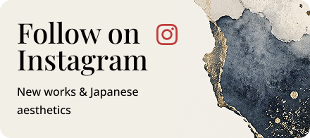
Source:The Metropolitan Museum of Art(https://www.metmuseum.org/art/collection/search/37045)
The support is washi, handmade Japanese paper, usually from kōzo (paper mulberry) fiber, which is long, strong, and highly absorbent. Colorants were traditionally plant- and mineral-based, with sumi (carbon ink) for black. Several were fugitive: safflower red (benibana) and dayflower blue (aigami) fade dramatically under light. Prussian blue, imported and adopted widely around 1829–1830, was far more stable, which is why Hokusai’s and Hiroshige’s blues can still look startling while the pinks beside them have vanished.
Worth knowing by name: bokashi (hand-wiped tonal gradation, the reason Hiroshige skies glow), kirazuri (mica ground, giving a shimmering backdrop), karazuri (blind embossing, printing without pigment to raise texture), and shomen-zuri (localized burnishing to create sheen). These effects are labor-intensive, are usually dropped from later strikes, and are among the fastest ways to distinguish a fine impression from a routine one.
Original prints versus reproductions
The market uses “original print” to mean a sheet printed from the artist’s or publisher’s own matrix during a legitimate production run. That includes modern hand-printed sheets by recognized studios, provided they are described honestly. It does not include photomechanical reproductions — offset, collotype, or inkjet facsimiles — which are made in unlimited numbers and hold no collectible value, however handsome they look framed.
The practical test is physical. On a genuine moku-hanga sheet, color sits within the paper, edges of color fields are slightly soft and occasionally overlap, the back often shows faint pigment bleed-through, and a raking light reveals the impression of the block. A reproduction under a loupe shows a regular dot or rosette pattern and a flat, uniform surface.
The Market: What Japan Art Prints Cost and What Moves Value
Japanese prints trade across an unusually wide price spectrum, with active sale rooms at Christie’s and Sotheby’s in New York and London, Bonhams, Heritage Auctions, Shinwa and SBI Art Auction in Tokyo, and a dense network of specialist dealers in Tokyo, Kyoto, New York, London and Amsterdam. The category is well documented, and published auction results provide a genuine reference point — a rarity in the art market.
The single most quoted data point is Hokusai’s Under the Wave off Kanagawa. Christie’s New York sold an impression for $1,590,000 in March 2021, and another for $2,760,000 in September 2023, the latter reported as a record for a Japanese woodblock print. Those figures belong to exceptional early impressions with outstanding color; they are the ceiling of the category, not its center of gravity.
Indicative price ranges
The table below gives working ranges observed across international auction and specialist dealer markets between roughly 2021 and 2025. They are orientation figures for budgeting, not appraisals: condition and impression quality can push an individual sheet well outside its band in either direction.
| Category | Typical range (USD) | Notes |
|---|---|---|
| Modern hand-printed reproductions of Edo designs | $100 – $600 | Decorative value; honest studios label them clearly |
| Ukiyo-e by secondary artists, average condition | $200 – $1,500 | Late Utagawa school, Meiji-period sheets, trimmed examples |
| Shin-hanga, later or posthumous strikes | $300 – $1,500 | Hasui and Shinsui subjects printed after 1957 |
| Shin-hanga, fine early impressions | $2,000 – $15,000+ | Pre-1923 Watanabe issues; scarce Goyō subjects higher |
| Yoshida Hiroshi, jizuri-sealed lifetime impressions | $1,500 – $8,000 | Signature subjects such as the Sailing Boats series at the upper end |
| Sōsaku-hanga, mid-century | $400 – $8,000 | Saitō Kiyoshi, Hiratsuka Un’ichi, Azechi Umetarō |
| Munakata Shikō | $2,000 – $50,000+ | Large-format works and early impressions lead |
| Hiroshige, fine early impressions of key series | $3,000 – $40,000 | Hōeidō Tōkaidō and One Hundred Famous Views of Edo |
| Hokusai, Thirty-six Views of Mount Fuji | $10,000 – $150,000+ | The Great Wave and Red Fuji far above; six to seven figures |
| Utamaro and Sharaku, fine impressions | $20,000 – $500,000+ | Thin supply; museum competition |
| Contemporary editions (Kusama, Nara and peers) | $5,000 – $150,000+ | Edition size, date and subject drive dispersion |
The five value drivers
Impression quality comes first, as described above. Color survival comes second: because the most fugitive pigments were reds and purples, a sheet that retains its original pinks and deep purples is worth a large multiple of a sun-bleached one. The famous benchmark for untouched color is the Spaulding Collection at the Museum of Fine Arts, Boston, given in 1921 with the stipulation that the prints never be exhibited — a standard most sheets on the market cannot meet.
Condition comes third and covers trimming, backing, worm damage, staining, and repairs. Fourth is rarity of the specific design rather than the artist: a common Hiroshige station scene and a scarce one from the same series are different assets. Fifth is provenance — collection stamps, documented sale history, and inclusion in the standard catalogues raisonnés give buyers and their advisors something to underwrite.
Where to buy
Auction offers transparency on comparables and, occasionally, competitive pricing, but you buy on your own judgment and pay a buyer’s premium that typically runs from the mid-twenties in percentage terms. Specialist dealers cost more at the point of sale and earn it in selection, condition reporting, and willingness to take a piece back; for a first serious purchase, that difference is usually worth paying. Art fairs and the Tokyo dealer network compress a great deal of comparison into a short window, which is valuable if you are buying a group rather than a single sheet.
Authentication, Condition, and the Traps to Avoid
Outright forgery is less common in this field than honest ambiguity. The prevailing risk is not a fake but a later, lesser version of a genuine design being sold — or bought — as something it is not. Learning to read the object’s own evidence resolves most of it.
Seals, signatures, and dating marks
Edo-period sheets frequently carry censorship and date seals that allow tight dating. The kiwame (“approved”) seal was used from 1790, replaced by censor name seals in the 1840s, with combined date and censor seals using the zodiac calendar from 1852 onward. These marks are reproduced in standard references and are among the most reliable dating tools available.
For shin-hanga, publisher seals do the same job. Watanabe’s studio used a succession of marks over the decades, and because the Great Kantō earthquake of 1 September 1923 destroyed his blocks and stock, sheets carrying pre-earthquake seals are scarce and command a substantial premium. Yoshida’s jizuri seal and his pencil-signed titles similarly separate lifetime from posthumous impressions.
Posthumous and recut editions
Many popular blocks continued to be printed after an artist’s death, sometimes for decades, and some famous designs were freshly recarved in the twentieth century by respected workshops. These are legitimate objects, well made, and entirely reasonable to own — at the right price, which is a fraction of a lifetime impression. Problems arise only when a listing describes such a sheet simply by artist and title.
Ask three questions before any purchase above a few hundred dollars: is this impression lifetime or posthumous, what evidence supports that, and has the sheet been trimmed. A dealer who answers all three without hesitation is worth returning to.
Condition language and what it hides
Common descriptors reward close reading. “Trimmed to image” means the margins are gone, which typically halves value. “Backed” or “laid down” means the sheet has been mounted to a support, often to stabilize damage, and complicates future conservation. “Toned” can mean anything from gentle warmth to significant acidic discoloration. “Album sheet” often indicates binding holes along one edge. None of these are disqualifying at the right price; all of them should be priced in.
Documentation worth keeping
Retain the invoice with a full description, any auction catalogue entry, the condition report, and photographs of the sheet out of the frame, front and back, in raking light. If the work is catalogued in a standard reference, note the number. For insurance and resale, this file is often worth more than the frame it came in.
Living With Japanese Prints: Scale, Light, and Installation
Japanese prints are, physically, small sheets of light-sensitive paper. That creates two practical design problems — how to give them presence on a large wall, and how to display them without destroying them — both of which have well-established solutions. This is also where the category’s interior appeal becomes concrete: the palettes are restrained, the compositions are asymmetric and calm, and a well-hung group of prints anchors a room without dominating it.
Formats and scale
The standard Edo format, ōban, measures roughly 38 × 25.5 cm (about 15 × 10 in). Chūban is about half that; hosoban is a narrow vertical used widely for actor prints. Vertical kakemono-e sheets, at roughly 76 × 26 cm, were designed to echo the proportions of a hanging scroll and read beautifully in a narrow pier or beside a doorway. Diptychs and triptychs — two or three ōban sheets forming one composition — reach around 75 cm wide and are the natural choice when a single work has to carry a wall.
For a large space, the reliable strategies are the grid and the run. Six to nine ōban sheets in identical frames, hung as a tight grid with 5–8 cm between frames, become a single architectural field. A horizontal run of four to six sheets along a corridor at consistent center height does the same work in hospitality settings, where guests read the wall while moving. Shin-hanga series lend themselves to both because their palettes were designed to sit together.
Light, glazing, and rotation
Light damage to works on paper is cumulative and irreversible. Museum practice for prints is illumination around 50 lux with ultraviolet filtration, and rotation of displayed sheets on a cycle of roughly three to four months. Private display does not have to be that strict, but the principles hold: never hang a print in direct sunlight, keep it off walls that receive strong afternoon sun, and use UV-filtering glazing, which blocks the large majority of ultraviolet radiation.
Acrylic glazing is lighter, shatter-resistant and safer for stairwells, corridors, and anywhere above seating. Museum-grade anti-reflective glass gives the best optical result for a principal wall. In both cases, insist on acid-free, buffered mats and hinging with Japanese paper and wheat starch paste. Dry mounting and adhesive tape are permanent, value-destroying, and unfortunately common in older framing.
Environment matters as much as light: stable conditions of roughly 18–22°C and 45–55% relative humidity, away from fireplaces, bathrooms, kitchen vapor, and exterior walls prone to condensation. Collectors with larger holdings often hang a working selection and rotate seasonally from flat storage, which is both good conservation practice and a genuine pleasure.
Residential, hospitality, and corporate contexts
In residential interiors, prints suit rooms where people linger at close range — studies, bedrooms, dining rooms, stair landings — because their detail rewards proximity. In hospitality projects, guest rooms and suites are the natural home for original sheets, with corridors and lobbies usually better served by larger contemporary works or Nihonga panels that hold a long sightline. Corporate environments introduce a further constraint: open-plan lighting tends to be bright and constant, so UV filtration and careful placement away from glazing are not optional.
Subject matter deserves the same care as scale. Landscape and seasonal imagery reads as calm and is safe in shared and client-facing spaces. Actor prints and ghost subjects are visually powerful but carry narrative charge that can sit oddly in a reception area. Bijin-ga is elegant and historically central, though worth considering thoughtfully in some workplace settings.
Pairing prints with Nihonga
The most satisfying Japanese-art interiors rarely rely on prints alone. A group of shin-hanga landscapes gains enormously from one larger painted work nearby — a Nihonga panel or framed painting in mineral pigment, whose ground of powdered azurite, malachite, or shell white catches light in a way no printed sheet can. The painting supplies mass and luminosity; the prints supply detail and rhythm.
Because Nihonga uses the same pigment family and the same compositional instincts as the print tradition, the two register as one collection rather than two. It is also a practical pairing: the Nihonga work carries the principal wall, and the prints occupy the intimate, lower-light positions where they are safest.
Building a Collection That Holds Its Value
Buyers who do well in this field tend to share a few habits. They buy the best impression they can afford rather than the most famous title, on the understanding that a superb Hiroshige will outperform a tired Hokusai at the same price. They handle sheets out of the frame before committing, because color and condition are invisible behind glass.
They also collect with a thesis. A group built around a single publisher, a single decade, a coherent palette, or one subject — snow scenes, harbors, Mount Fuji — is more compelling on a wall and more saleable later than an assortment of unrelated highlights. And they keep the paperwork, because a documented sheet is an asset while an undocumented one is a decoration.
Finally, they treat conservation as part of the purchase price. Correct framing on a $2,000 print costs a meaningful fraction of the work itself and protects all of it. Over a decade of daylight, the difference between UV-filtering glazing and ordinary glass is the difference between a print that still has its reds and one that does not.
Whether you are acquiring a single sheet for a study or building a coordinated scheme across a residence or hotel, the same logic applies at every scale: choose quality of impression over fame, control light, and let a painted work anchor the room the prints animate. If that painted anchor is what your space is missing, Nihonga — the tradition that shares the prints’ mineral palette and compositional calm — is the natural place to look next.
Discover Nihonga for Contemporary Spaces
Shop carefully selected Nihonga,
curated by experienced Japanese art dealers
for homes and commercial spaces worldwide.