
Japandi Art
Japandi Coffee Table: A Styling Guide with Japanese Art
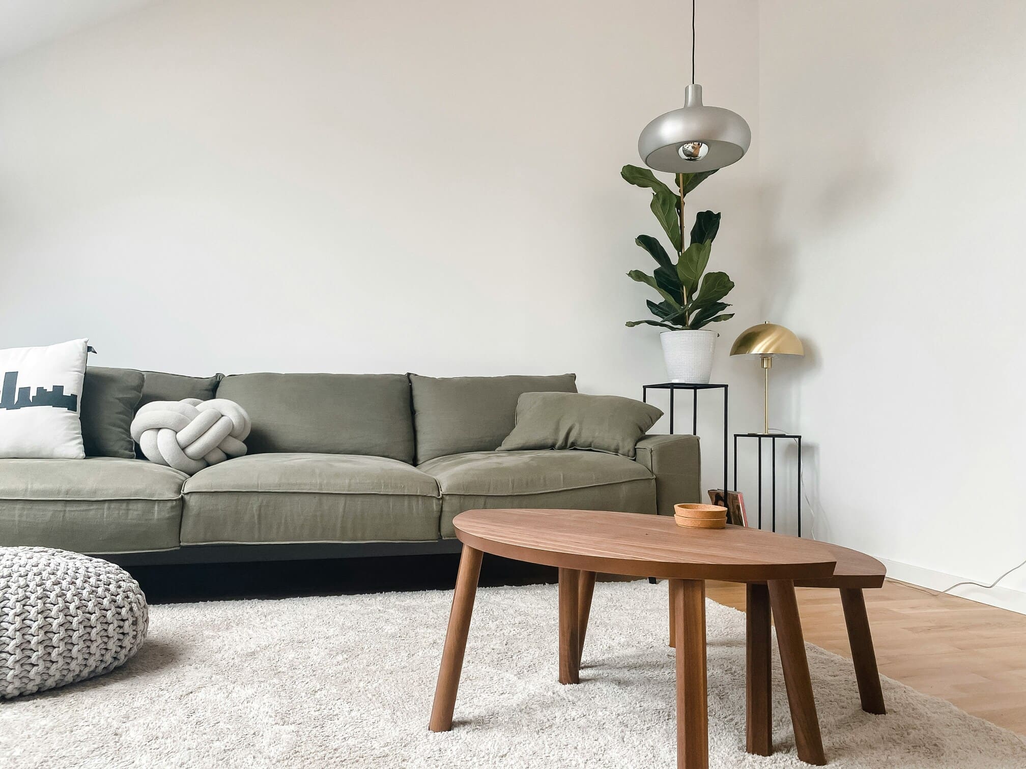
The Japandi coffee table has quietly become one of the most-searched objects in contemporary interior design, sitting at the center of a hybrid aesthetic that fuses Japanese restraint with Scandinavian warmth. For collectors, designers, and homeowners building rooms around this style, the coffee table is rarely just a surface for cups and books — it is the anchor that sets the proportion, palette, and tonal register of the entire seating area, including the artwork chosen to live above and around it.
This guide looks at what actually defines a Japandi coffee table, how to evaluate materials and form, how to style the tabletop with intention, and — most importantly for art-led interiors — how to pair the piece with authentic Japanese painting, particularly Nihonga (Japanese-style painting using traditional mineral pigments on washi paper or silk). The goal is to help you make choices that read as considered rather than catalogue-assembled.
What Defines a Japandi Coffee Table
Japandi is a portmanteau of “Japanese” and “Scandinavian,” and the two traditions share more than the marketing label suggests. Both prize natural materials, honest joinery, muted palettes, and the idea that an object should reveal itself slowly. A Japandi coffee table sits at the intersection: low to the ground, often built from a single timber species, finished to show rather than hide the grain, and proportioned to invite stillness rather than spectacle.
The deeper philosophical reference is to wabi-sabi, a Japanese aesthetic sensibility that finds beauty in imperfection, transience, and modesty. A Japandi coffee table influenced by this idea will tolerate — even celebrate — a knot in the wood, a slight asymmetry in the leg, or the matte patina that comes from years of use. The Scandinavian contribution is functionalism: clean geometry, ergonomic height, and a refusal of ornament for its own sake.
How It Differs from a Generic Modern Coffee Table
A standard modern coffee table optimizes for visual impact and storage. A Japandi piece optimizes for negative space, what the Japanese call ma — the considered emptiness around and between objects. The tabletop is often deliberately under-styled, with a single tray or vessel rather than a curated cluster. Heights tend to sit between 30 and 38 centimeters, lower than the Western norm, encouraging the lounging, floor-adjacent posture typical of Japanese living rooms.
The Role of the Coffee Table in a Japandi Room
Because Japandi interiors strip away decorative layers, the coffee table carries a disproportionate share of the room’s character. It establishes the wood tone that the dining chairs, shelving, and frames around any art will echo. It dictates seating height. And it sets the threshold of formality: a thick, slab-cut walnut piece reads as quietly luxurious, while a pale ash table with tapered legs reads as airy and almost domestic. The art chosen for the walls above the seating arrangement should respond to this register, not fight it.
Materials, Form, and Proportion
The single most important decision when choosing a Japandi coffee table is the wood. Scandinavian traditions favor oak, ash, and beech — light-toned, often soap-finished or hard-wax-oiled to preserve a near-raw surface. Japanese traditions favor hinoki (Japanese cypress), keyaki (zelkova), kuri (chestnut), and increasingly walnut from domestic Tōhoku forests. Each species has a distinct color, grain pattern, and aging behavior, and the choice will determine how the room ages over a decade of use.
Joinery matters more in this aesthetic than in most contemporary furniture categories. Visible through-tenons, butterfly keys bridging a natural crack, or a finger-jointed apron are not flaws to conceal but evidence of intention. A well-made Japandi table will often be assembled without metal hardware, relying instead on woodworking techniques refined over centuries in both Nordic and Japanese workshops.
Finishes: Oil, Wax, and Urushi
Finishes divide along regional lines. Scandinavian makers tend toward natural oils and hard wax, which preserve a dry, tactile surface. Japanese makers may use urushi, a refined sap from the lacquer tree, applied in dozens of thin coats and polished to a deep, almost liquid sheen. Urushi-finished tables are rarer in the Japandi market because the labor is significant, but they offer a depth of surface that no synthetic lacquer matches and they pair exceptionally well with the mineral luster of Nihonga pigments.
Shape and Scale
Rectangular tables anchor a sofa-and-armchair arrangement and provide more usable surface for trays and books. Round and oval tables soften a room and work better in smaller footprints or where circulation around the seating is tight. A useful rule for proportion: the table should be roughly two-thirds the length of the main sofa, and its top should sit within a few centimeters of the seat cushion height. Going lower is more authentically Japanese; going higher leans Scandinavian-modern.
| Feature | Japanese-leaning | Scandinavian-leaning |
|---|---|---|
| Typical wood | Hinoki, keyaki, kuri, walnut | Oak, ash, beech |
| Finish | Urushi, raw, light oil | Soap, hard-wax oil |
| Height | 30–35 cm | 35–42 cm |
| Joinery emphasis | Visible mortise, butterfly keys | Clean miters, dowels |
| Surface character | Live edge, knots, grain figure | Uniform, calm grain |
Styling the Tabletop: Restraint as a Design Principle
The fastest way to dilute a Japandi coffee table is to over-style it. Three to five objects is typically the upper limit, and even that can be one or two too many depending on the size of the table. The goal is to compose a still life that the eye can read in seconds, then leave alone.
A reliable starting point is a single wooden or lacquered tray that gathers the smaller items into one visual unit. On the tray, a ceramic vessel — shino, oribe, bizen, or hagi ware are all stylistically aligned — holds either a seasonal flower arrangement (ikebana) or a single branch. Beside the tray, one substantial book or a small stack of two reinforces horizontality. That is often enough.
Ceramics That Belong on the Surface
Japanese pottery traditions offer a vocabulary perfectly suited to Japandi composition. Bizen ware, fired without glaze in wood-burning kilns in Okayama prefecture, produces earthy reds and browns with surface flashing. Shino ware brings soft white glazes with pinholes and warm scorch marks. Oribe ware introduces deep green where a stronger color accent is wanted. Hagi ware ages visibly with use, developing a fine crackle pattern that wabi-sabi sensibility prizes. Any of these will sit comfortably on a Japandi table without disrupting the palette.
The Discipline of Ma
Ma — negative space — is the most underused tool in residential styling. On a Japandi coffee table, the empty surface is not waiting to be filled; it is doing work. It allows the wood grain to be read as an image in its own right, it gives the eye a place to rest before moving up to the artwork on the wall, and it preserves the table’s actual function as a useful surface for daily life. Resist the impulse to add a candle, a coaster set, and a decorative bowl simply because there is room.
Pairing a Japandi Coffee Table with Japanese Art
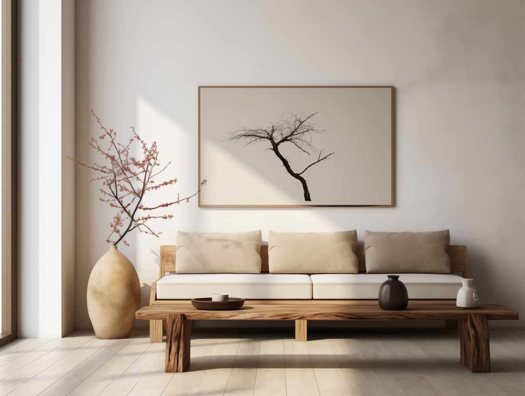
The wall behind the sofa, and by extension the visual field above the coffee table, is where Japandi interiors most often falter. Generic abstract canvases or mass-produced botanical prints read as filler, and the carefully chosen table loses its conversation partner. Authentic Japanese painting — and Nihonga in particular — closes this gap with material logic the rest of the room can recognize.
Nihonga is the modern term for Japanese-style painting that uses traditional materials: iwa-enogu (mineral pigments ground from azurite, malachite, cinnabar, and other minerals), suihi-enogu (refined earth pigments), sumi ink, and supports of washi paper or silk, often with applied gold or silver leaf. The technique was formalized in the late nineteenth century to distinguish Japanese painting from imported Western oil painting, and it remains a living tradition practiced by contemporary artists working in everything from classical seasonal subjects to large-scale abstraction.
Why Nihonga Reads Well Above a Japandi Coffee Table
Three qualities make Nihonga an especially good partner for this furniture style. First, the mineral pigments carry a subtle granular texture and a depth of color that printed reproductions cannot replicate, and that depth answers the depth of a well-finished wood surface below. Second, the palette of traditional Nihonga — earthy greens, mineral blues, ink blacks, soft golds — sits naturally with oak, walnut, hinoki, and the muted textiles common in Japandi rooms. Third, gold or silver leaf grounds catch ambient light in a way that animates the room at different times of day without requiring additional accent lighting.
Formats and How They Work in a Living Room
Japanese painting comes in several traditional formats, each of which behaves differently in a contemporary interior. Understanding the options helps designers and homeowners specify intelligently.
| Format | Description | Best use above a coffee table |
|---|---|---|
| Kakejiku (hanging scroll) | Vertical scroll mounted on silk, rolled for storage | Narrow walls beside the sofa or in an alcove; vertical accent |
| Byōbu (folding screen) | Multi-panel folding screen, two to six panels | Behind a low sofa as a wide horizontal field; can stand free |
| Gakubuchi (framed panel) | Painting mounted in a fixed Western-style frame | Standard wall hanging above the seating area |
| Fusuma-e (sliding door panel) | Painting on sliding interior doors | Architectural integration in renovations or new builds |
For most contemporary Japandi rooms, a framed Nihonga panel or a two-panel byōbu offers the most usable horizontal mass above a sofa-and-coffee-table arrangement. A kakejiku works beautifully where the wall is narrow or where the design vocabulary leans more strictly Japanese, since the scroll itself is a designed object whose silk mounting becomes part of the composition.
Subject Matter and Palette Coordination
Seasonal subjects — cherry blossoms, autumn maples, snow on pine — are the most recognizable Nihonga themes, but they are not the only options and not always the best for a year-round living space. Bird-and-flower (kachō-ga) compositions, landscape (sansui), and contemporary abstract Nihonga that explores color fields and gold-leaf grounds can all anchor a Japandi room without locking it to a single season. When in doubt, match the dominant pigment family of the painting to the wood tone of the coffee table: warm walnut pairs with reds and golds, pale oak pairs with mineral blues and greens, and dark stained or urushi-finished tables can carry stronger ink-driven compositions.
Practical Considerations for Homes and Commercial Spaces
Japandi rooms are now appearing well beyond residential settings. Boutique hotels, restaurant lounges, executive offices, and members’ clubs increasingly specify the aesthetic for its calm and its photographic legibility. The practical considerations shift slightly between contexts, and any serious buyer should think about them before purchase rather than after.
Light, Humidity, and Conservation
Nihonga paintings on washi or silk are sensitive to ultraviolet light and to swings in humidity. In a residential setting, the standard advice is to avoid hanging works in direct sunlight, to keep relative humidity reasonably stable, and to consider UV-filtering glazing for framed pieces. In hospitality and commercial settings, where lighting is often more intense and climate control more aggressive, these considerations become specifications rather than suggestions. Byōbu screens are particularly forgiving in this regard because they can be repositioned away from sunlight as room use changes.
Scale for the Room
A common mistake in pairing art with a Japandi coffee table is underscaling the wall piece. The seating arrangement is low and horizontal; the artwork above it should be generous enough to carry the visual weight. As a rough guide, a framed work should span at least two-thirds the length of the sofa it sits above, and a byōbu should occupy a similar or greater horizontal field. Undersized art floats; properly scaled art completes the composition.
Living with the Work
One of the qualities that makes Nihonga particularly rewarding in a daily-use environment is the way mineral pigments and metal leaf respond to changing light. Morning sun reads the gold ground differently from evening lamplight, and the painting effectively performs across the day. This is the same quality that the coffee table itself, with its honest wood and honest finish, brings to the room. Together they form an interior that rewards being lived in rather than merely looked at.
For readers who have arrived here while planning a Japandi living room — whether for a private home, a hotel lounge, or an office reception — choosing the coffee table is often the easier half of the brief. Selecting the painting that lives above it tends to be where projects stall. The following section points toward where to continue that part of the search.
Discover Nihonga for Contemporary Spaces
Shop carefully selected Nihonga,
curated by experienced Japanese art dealers
for homes and commercial spaces worldwide.