
Japandi Art
Japanese Art Nails: The Motifs and Where They Come From

- What Makes a Nail Design Read as "Japanese Art"?
- The Wave and the Woodblock: Ukiyo-e Motifs at Miniature Scale
- Gold, Silver and the Rinpa Inheritance
- The Nihonga Palette: Why the Colours Look Different
- From Fingertips to Walls: The Same Motifs at Room Scale
- Where the Motifs Come From, in Their Original Form
- Discover Nihonga for Contemporary Spaces
Search for Japanese art nails and you will find a fairly consistent visual vocabulary: a curling wave in indigo and white, a scatter of gold flakes over a milky base, a hairline of gold running across a cracked-looking surface, cherry blossom on a cream ground. These designs are among the most requested in salons from Seoul to London, and the best of them are genuinely beautiful. They are also, almost without exception, borrowing from a specific and well-documented body of painting and printmaking.
Knowing where the motifs come from is not academic pedantry. It is the difference between a design that reads as authentically Japanese and one that reads as a costume. The proportions, the placement, the way gold is allowed to sit on a surface — these were worked out over centuries by painters and printmakers solving the same compositional problems a nail artist faces on a ten-millimetre canvas. This guide walks through the source material behind the most common Japanese art nail designs, explains the techniques and materials as they actually function, and finishes with what happens when the same motifs move from the hand to the wall.
What Makes a Nail Design Read as “Japanese Art”?
Before getting to individual motifs, it is worth isolating the underlying grammar. A design can contain no cherry blossom, no wave and no gold and still read unmistakably as Japanese, because the recognisability lives in structural choices rather than in subject matter. Four of these choices do most of the work.
Four visual habits that do most of the work
The first is flat colour. Traditional Japanese painting and woodblock printing build form from bounded areas of even colour rather than from modelled light and shade. A wave is a shape, not a lit volume. On a nail, this translates directly: crisp fields of opaque colour hold far better at small scale than gradients, which turn to mud once the surface curves away from the light.
The second is asymmetry. Western decorative traditions tend to centre and mirror. Japanese composition characteristically pushes the subject off-axis, often into a corner or along one edge, leaving the remainder open. A blossom branch entering from the cuticle at an angle is doing exactly what a branch does on a hanging scroll.
The third is outline. In woodblock printing the keyblock — the carved block that supplies the black contour — was printed first, and every colour block registered to it. That black line is not a border added at the end; it is the skeleton the colour hangs on. Designs that keep a confident dark contour read as Japanese; designs that soften every edge do not.
The fourth is metallic ground. Gold and silver leaf were used in Japanese painting not as highlight but as environment — the entire background of a screen might be gold, with the subject floating on it. This is the opposite of gold used as an accent, and it is why a full gold-flake nail with a single small motif looks correct while gold glitter scattered across a busy design does not.
Ma: the interval that carries the composition
Underneath all four sits the principle of ma (間), usually translated as negative space, though “charged interval” is closer. Ma is not leftover area. It is an active compositional element, deliberately sized, that gives the marked areas their tension and pacing.
The practical consequence for nail design is unusually direct. The most common failure in Japanese-inspired nail art is coverage — filling the plate because the plate is there. A design occupying forty percent of the nail with the rest left as clean base will almost always read as more sophisticated than the same design enlarged to fill the space, because the empty area is doing compositional work rather than waiting to be used.
The Wave and the Woodblock: Ukiyo-e Motifs at Miniature Scale
The single most-copied Japanese image in nail design comes from ukiyo-e (浮世絵, “pictures of the floating world”), the woodblock print tradition that flourished during the Edo period (1603–1868). Ukiyo-e prints were commercial, reproducible, and designed to be legible at a glance — qualities that make them exceptionally well suited to being reduced to fingernail scale.
Hokusai’s Great Wave and why it survives shrinking
Katsushika Hokusai’s Under the Wave off Kanagawa (Kanagawa-oki nami-ura), published around 1830–1832 as part of the series Thirty-six Views of Mount Fuji, is the most reproduced Japanese artwork in existence. Impressions are held by the Metropolitan Museum of Art, the British Museum and the Museum of Fine Arts, Boston, among many others. The image is long out of copyright, which is one reason it circulates so freely; a fine early impression sold at Christie’s New York in March 2021 for approximately USD 1.59 million, a record for the print at that time.
What makes it miniaturise so well is its silhouette. The wave is defined by a single continuous contour with clawed foam fingers at the crest — a shape that remains identifiable even when reduced to a few millimetres and stripped of internal detail. The colour scheme is similarly economical: a deep blue derived from imported Prussian blue, which had only recently become affordable in Japan, against white and pale sky.
Two errors recur in nail versions. The first is reversing the wave’s direction, which flips a composition built around left-to-right reading. The second is including Mount Fuji at a size that competes with the wave; in the original, Fuji sits small and low in the trough, and its smallness is the point.
Seigaiha, asanoha and the komon pattern families
Beyond narrative images, Japan has a deep repertoire of geometric repeats that predate ukiyo-e and were codified in textile dyeing. Komon refers broadly to small repeating patterns applied by stencil, associated particularly with Edo-period samurai dress, where subtlety signalled status. These patterns are ideal for nails because they scale infinitely and never depend on a focal point.
A quick reference to the classic repeats
| Pattern | Romanization | Form | Traditional association |
|---|---|---|---|
| 青海波 | Seigaiha | Concentric overlapping arcs, like fish scales or wave crests | Calm seas, continuity, good fortune |
| 麻の葉 | Asanoha | Six-pointed star lattice based on the hemp leaf | Vigorous growth; used on children’s clothing |
| 七宝 | Shippō | Interlocking circles forming four-petal shapes | The seven treasures; harmony and connection |
| 亀甲 | Kikkō | Hexagonal tortoiseshell grid | Longevity |
| 市松 | Ichimatsu | Offset checkerboard | Continuity, prosperity |
These read best in two colours with high value contrast, and they benefit enormously from being used on only one or two nails in a set rather than across all ten. A seigaiha accent nail beside plain polished neutrals reproduces the way these patterns actually appeared in dress — as a considered passage, not a total field.
Line quality: the keyblock discipline
The technical skill that separates competent Japanese-motif nail art from excellent work is line. Ukiyo-e keyblock lines vary in weight along their length — swelling and tapering — because they were carved, not drawn with a uniform nib. A wave contour that thickens at the curve’s belly and thins to nothing at the tip has the right character; one of even weight throughout looks mechanical.
This is one reason Japanese salon technique has developed the way it has. Detailed hand-painting with extremely fine brushes, rather than stamping or decals, remains the professional standard for this category of work, and it is a skill that takes years to build. There is no shortcut that produces the same result.
Gold, Silver and the Rinpa Inheritance
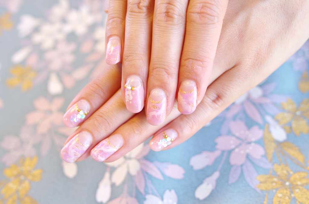
The second great source pool for Japanese art nails is the Rinpa school (琳派), a lineage rather than a workshop, running from the early seventeenth century through to the twentieth. Rinpa artists worked in bold, flattened, highly decorative compositions, frequently on gold or silver grounds, and their aesthetic is the direct ancestor of almost every gold-leaf nail design in circulation.
Kinpaku: how gold leaf actually behaves
Rinpa was established by the calligrapher Hon’ami Kōetsu and the painter Tawaraya Sōtatsu in Kyoto in the early 1600s, and carried forward most famously by Ogata Kōrin (1658–1716). Kōrin’s Irises screens, a National Treasure held by the Nezu Museum in Tokyo, place stylised blue-purple irises across an unbroken gold ground with no water, no bank and no horizon — pure motif on pure metal.
Kinpaku (金箔) is gold beaten to a leaf of extraordinary thinness, historically produced in Kanazawa, which still accounts for the overwhelming majority of Japanese gold leaf production. Applied to a screen it produces a surface that shifts with the viewer’s position and the ambient light, appearing anywhere from pale ivory to deep bronze across the day.
On nails, torn leaf fragments are used rather than continuous sheet, and the resulting broken-edge quality is closer to the deliberately fragmented gold of Japanese decorated papers than to Rinpa screen grounds. Both are legitimate references. What is worth avoiding is glitter standing in for leaf: glitter reflects as points, leaf reflects as planes, and the visual difference is immediate.
Tarashikomi and the wet-bleed effect
Tarashikomi (たらし込み) is the Rinpa technique of dropping one pigment into another while the first is still wet, allowing the two to bloom and pool into soft, unpredictable edges. Sōtatsu used it to give tree trunks and rocks a mottled, organic surface within otherwise flat compositions.
Nail artists arrive at something similar when they drop one gel colour into an uncured layer of another and let the boundary settle before curing. The effect is the closest thing in the Japanese decorative tradition to a gradient, and it works precisely because it is contained — a soft passage inside a design that is otherwise hard-edged.
Kintsugi nails, and what kintsugi really is
The gold-veined “cracked” nail is now a category of its own, and it is worth being accurate about its source. Kintsugi (金継ぎ, “golden joinery”) is a ceramic repair method, not a painting technique. Broken pottery is rejoined with urushi (漆), the refined sap of the lacquer tree, which cures into a hard, water-resistant adhesive. The seams are then dusted with gold powder using techniques drawn from maki-e, the lacquer decoration tradition.
Two points follow. First, real kintsugi lines are irregular in width and follow the physics of a genuine break — they branch, they run to edges, they do not form decorative loops. A convincing nail version should look like a fracture, not like calligraphy. Second, urushi is a potent allergen in its uncured state and has no place in nail work; the nail technique is an homage in gel and pigment, and describing it otherwise is simply inaccurate.
The Nihonga Palette: Why the Colours Look Different
Ask why Japanese-inspired designs so often have a distinctive chalky, softly luminous quality and the answer lies in materials. Nihonga (日本画, literally “Japanese-style painting”) is the term coined in the Meiji era (1868–1912) to distinguish painting in traditional Japanese materials from Western-style oil painting. Nihonga is defined by its materials rather than its subject matter, and those materials produce colours that behave unlike anything in a synthetic palette.
Iwa-enogu, gofun and nikawa
Iwa-enogu (岩絵具) are mineral pigments ground from semi-precious stones and other minerals — azurite for blue, malachite for green, cinnabar for vermilion. Crucially, they are graded by particle size, and particle size determines colour: the same azurite ground coarse yields a deep, glittering blue, while ground fine it yields a pale, powdery one. A Nihonga painter selecting a blue is choosing a grind, not just a hue.
Gofun (胡粉) is the traditional white, made from calcined and weathered oyster shell, ground to a fine powder. It is opaque, slightly warm, and gives Nihonga its characteristic matte-luminous whites. Both pigment types are bound with nikawa (膠), an animal-hide glue warmed and mixed by hand, which yields a matte surface with none of oil paint’s gloss.
Translating mineral colour into polish and gel
Because mineral pigments scatter light through visible crystalline particles rather than absorbing it in a smooth film, they never look quite like synthetic colour. The table below sets out the correspondences most useful when trying to match the effect.
| Nihonga material | Colour character | Closest nail equivalent |
|---|---|---|
| Gunjō (azurite, coarse grind) | Deep blue with visible sparkle in the film | Fine-shimmer navy or indigo gel, not flat crème |
| Gunjō (fine grind) | Pale, dusty, slightly greyed blue | Muted powder-blue crème with a matte topcoat |
| Rokushō (malachite green) | Cool grey-green, mineral rather than vegetal | Desaturated sage or celadon, avoiding yellow-greens |
| Shu (vermilion) | Warm orange-red, dense and opaque | Opaque orange-red crème; avoid blue-based reds |
| Gofun (shell white) | Warm, opaque, matte-luminous | Off-white crème with matte finish, never cool bright white |
| Nikawa binder surface | Fully matte, light-absorbing | Matte topcoat across the whole nail |
The single most effective adjustment is finish. High-gloss topcoat is the default in most salons, and it is the enemy of a Nihonga-referencing palette, because it introduces a specular sheen that mineral pigment in glue binder never produces. A matte or satin finish, with gold leaf left as the only reflective element, gets far closer to the source.
From Fingertips to Walls: The Same Motifs at Room Scale
Nail art is where a great many people first encounter these motifs, and it is a real point of entry rather than a trivial one. But the images were built for other formats, and it is instructive to see what changes when they return to the scale they were designed for — a folding screen, a hanging scroll, a framed panel on a wall.
Scale, format and where the eye lands
A composition that resolves in ten millimetres has to declare itself instantly. At room scale, the opposite obligation applies: the work has to reward a second and third look from different distances. This is why the ma discussed earlier matters even more in a painting than on a nail. A Nihonga panel with a large area of quiet ground gives a room somewhere to rest, which is precisely why these works sit so well in interiors that are otherwise busy.
Format carries meaning too. The horizontal proportions of a screen suit a wall above a low sofa or a console; the tall, narrow proportions of a scroll-derived panel suit a hallway or a stairwell where the viewer approaches from the side. Getting format right does more for a room than getting subject matter right.
Light, palette and living with the work
Mineral pigments and gold ground respond to light in a way flat reproduction cannot. Gold leaf shifts through the day, warm at low sun and near-white under midday brightness — which is why screens were traditionally placed to catch oblique rather than direct light. In a contemporary interior, that argues for a wall lit from the side rather than one facing a window straight on.
Conservation in a lived-in space is straightforward but non-negotiable. Nikawa-bound pigment and paper supports do not tolerate direct sunlight, which fades organic colourants and embrittles paper, and they do not tolerate large humidity swings, which is why placement above a radiator or opposite an unshaded south-facing window is a mistake. UV-filtering glazing, stable ambient humidity in roughly the 45–55 percent range, and indirect light will keep a work stable for generations — the same conditions any museum applies, and none of them incompatible with an ordinary home or hotel lounge.
Where the Motifs Come From, in Their Original Form
The vocabulary behind Japanese art nails — the off-centre branch, the gold that acts as environment rather than accent, the mineral blue that changes with the grind, the interval left deliberately empty — was developed by painters working in a specific set of materials for specific formats. Understood at that level, it becomes portable: the same principles that make a wave read correctly on a nail make a panel read correctly on a wall.
For readers who find themselves drawn to the source rather than the reference, contemporary Nihonga is where that tradition is still being practised — iwa-enogu, gofun and nikawa handled by working painters, in formats made for real rooms.
Discover Nihonga for Contemporary Spaces
Shop carefully selected Nihonga,
curated by experienced Japanese art dealers
for homes and commercial spaces worldwide.