
Japandi Art
Japanese Wave Art: The Great Wave and Its Legacy
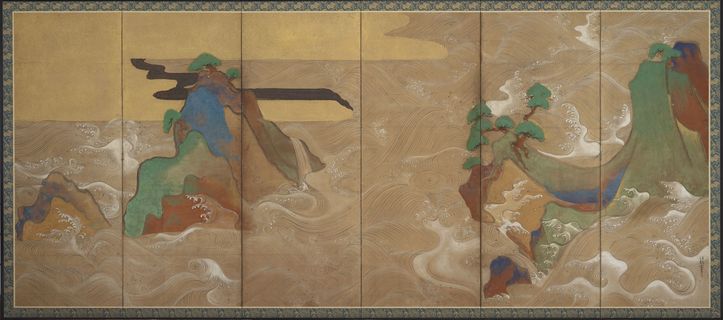
Few images travel as far as a Japanese wave. A single woodblock print made in Edo around 1831 now appears on passports, phone screens, café walls and museum façades from Los Angeles to Lisbon. But Japanese wave art is a far wider field than one famous print, and for anyone buying with intent — a collector building a focused holding, a designer specifying art for a lobby, an advisor assembling a corporate collection — the distinctions matter enormously.
This guide sets out what Japanese wave art encompasses, how the canonical works were physically made, what governs their value on the international market, and how wave imagery behaves once it leaves the auction room and enters a lived-in space. The emphasis throughout is practical: what you are actually looking at, what it is likely to cost, and what it will demand of you once it is on the wall.
What “Japanese Wave Art” Actually Refers To
The phrase covers at least three distinct traditions that developed on different timelines, use different materials, and occupy different price bands. Conflating them is the most common error made by first-time buyers, and it leads to disappointment in both directions — paying print-market prices for a reproduction, or overlooking a serious painting because it does not resemble the image everyone knows.
Ukiyo-e, Nihonga and Decorative Pattern
Ukiyo-e (“pictures of the floating world”) refers to the woodblock print and painting culture of the Edo period (1603–1868), aimed at a broad urban audience and produced through a division of labour between artist, block carver, printer and publisher. Hokusai’s wave belongs here. These are multiples, printed in editions that were never formally numbered or limited, which shapes everything about how they are valued.
Nihonga (“Japanese-style painting”) is a term coined in the Meiji era (1868–1912) to distinguish painting made with traditional Japanese materials and methods from imported Western oil painting, known as yōga. A Nihonga work is typically painted on silk or washi (Japanese handmade paper) using iwa-enogu (mineral pigments ground from stone and minerals), gofun (a white made from calcined shell), sumi (carbon ink), and nikawa (animal-hide glue) as the binder, often with gold or silver leaf. These are unique works, not multiples, and the market treats them accordingly.
Then there is pattern. Seigaiha — the stylised “blue sea wave” motif of concentric overlapping arcs — is a design vocabulary rather than a genre, appearing on textiles, ceramics, lacquer and architectural fittings. It is decorative art history rather than fine art, and while beautiful, it does not trade in the same market as a signed painting or a documented early print impression.
Why Water Became a Central Japanese Subject
Japan is an archipelago of roughly 14,000 islands where no point sits especially far from the coast, and where the sea has been simultaneously the source of livelihood, the route of trade, and the agent of catastrophe. That ambivalence is legible in the art. Waves in Japanese painting are rarely purely pretty; they carry force, and often a human figure or vessel is present to register the scale of that force.
There is also a formal reason. Water is the ideal subject for an artistic culture that prizes rhythm, repetition with variation, and the tension between flat decorative surface and depicted depth. A wave can be rendered as pure calligraphic line, as flat pattern, as naturalistic observation, or as all three at once within a single composition — which is precisely what makes the best examples endlessly re-readable on a wall you pass every day.
The Great Wave off Kanagawa: Anatomy of an Icon
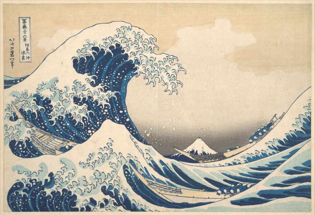
Source:The Metropolitan Museum of Art(https://www.metmuseum.org/art/collection/search/39799)
Katsushika Hokusai (1760–1849) designed Kanagawa-oki Nami Ura — usually translated as “Under the Well of the Great Wave off Kanagawa” — as the opening image of his series Fugaku Sanjūrokkei, Thirty-six Views of Mount Fuji. The series was published by Nishimuraya Yohachi (whose publishing house operated under the name Eijudō) beginning around 1830–1831. Despite the title, the series eventually ran to forty-six designs, ten having been added after the initial thirty-six proved commercially successful.
Hokusai was around seventy when he designed it, working under the art name Iitsu; the signature on the print reads “Hokusai aratame Iitsu hitsu” — “from the brush of Iitsu, formerly Hokusai.” Understanding that this is a late-career work by an artist who had already been reinventing his practice for five decades helps explain its extraordinary compositional confidence.
How the Print Was Made
The print is a nishiki-e (“brocade picture”), a full-colour woodblock print produced from multiple carved cherrywood blocks. It is in ōban format, the standard large sheet of the period, measuring roughly 25 by 37 centimetres (about 10 by 14.6 inches). That is smaller than most people expect — a fact worth internalising before planning a wall around one.
Production began with Hokusai’s brush drawing, the hanshita-e, which was pasted face-down onto a block and carved away, destroying the original drawing in the process. A key block carrying the outlines was printed first, and separate blocks were cut for each colour area. The printer applied pigment with a brush and transferred it to dampened kōzo (mulberry-fibre) paper by rubbing the back of the sheet with a baren, a coiled disc-shaped pad. Tonal gradations in the sky and sea — bokashi — were produced by hand-wiping the block before each impression, which is why no two sheets are perfectly identical.
Prussian Blue and the Colour That Defined a Series
The deep blue that carries the composition is Prussian blue, known in Japan as bero-ai, a synthetic pigment developed in Europe in the early eighteenth century and reaching Japanese printmakers in commercially viable quantities by the late 1820s through trade at Nagasaki. Its arrival was genuinely transformative: traditional indigo faded quickly and printed unevenly, while Prussian blue offered intensity, stability and a range of dilutions from near-black to pale sky.
Thirty-six Views of Mount Fuji was marketed partly on the novelty of this blue, and some early impressions of the series were printed predominantly in blue tones. For a buyer, this is not trivia — the colour is a dating and authentication signal, and its behaviour under light is central to condition assessment.
How Many Great Waves Exist
Because Edo-period prints were commercial products, no edition size was recorded. Scholarly estimates for total impressions of the Great Wave across the life of the blocks generally fall in the range of several thousand — commonly cited figures run from around 5,000 upward, with some specialists suggesting up to 8,000. The blocks wore down and were eventually recut or retired, so later impressions differ visibly from early ones.
Of those thousands, the number of surviving impressions in documented public and private hands is far smaller — institutional holdings number in the low hundreds worldwide. Major examples are held by the Metropolitan Museum of Art in New York, the British Museum in London, the Museum of Fine Arts in Boston, the Art Institute of Chicago, the Musée Guimet in Paris, and the Sumida Hokusai Museum and Tokyo National Museum in Japan. Comparing impressions across these collections online is the single most useful free education a prospective buyer can give themselves.
Reading an Impression: Early, Late, and Reproduction
Three categories of object circulate under the same title, and they differ in value by several orders of magnitude. The first is a genuine Edo-period impression pulled from the original blocks. Within this group, early impressions show crisp keyblock lines, a clean unbroken outline in the cartouche and signature area, a pink or apricot tone in the sky near the horizon, and subtle bokashi gradation. Later impressions show blunted lines, simplified or absent gradation, and often a flatter, harder blue.
The second category is a Meiji-era or twentieth-century restrike or facsimile — printed from recut blocks by later publishers, sometimes to a high craft standard. These are legitimate objects with real but modest value, and they are frequently offered, in good faith or otherwise, as “antique woodblock prints.”
The third is a modern reproduction: offset lithograph, giclée, or a contemporary hand-carved revival print. These have decorative value only. The practical test for a buyer is magnification — a loupe will reveal the dot screen of an offset reproduction immediately — combined with paper examination, since genuine kōzo paper has a fibrous, slightly irregular surface that modern wove papers do not replicate.
Beyond Hokusai: Waves in Rinpa, Shin-hanga and Nihonga
For collectors who want wave imagery without competing for a print that the entire world recognises, the surrounding territory is where value and originality tend to sit. These works are less reproduced, less counterfeited, and in many cases more rewarding to live with over years.
Rinpa and the Decorative Wave
The Rinpa school — a lineage rather than a formal academy, running from Tawaraya Sōtatsu and Hon’ami Kōetsu in the early seventeenth century through Ogata Kōrin (1658–1716) and later Sakai Hōitsu — treated the wave as bold, stylised, gold-ground design. Kōrin’s celebrated two-panel screen of rough waves, held by the Metropolitan Museum of Art, reduces surf to muscular curling forms against gold, with almost no naturalistic modelling.
Rinpa wave imagery is the ancestor of a great deal of later Japanese decorative work, and its flatness and gold ground make it unusually compatible with contemporary architecture. Period Rinpa screens are museum-level objects, but the idiom continues actively in modern and contemporary Nihonga, where the same compositional logic is applied at accessible price points.
Shin-hanga and the Quiet Wave
Shin-hanga (“new prints”) was an early twentieth-century movement led commercially by the publisher Watanabe Shōzaburō, which revived the collaborative woodblock system for a modern, largely export-oriented audience. Its wave imagery is calmer and more atmospheric than Hokusai’s — Uehara Konen’s wave designs of the 1910s are the standard reference point, rendering swells in soft gradation with a near-abstract restraint.
Shin-hanga prints are, for most buyers, the most sensible entry into collectible Japanese wave imagery: genuinely hand-printed, well documented, dated within living archival memory, and available in good condition without seven-figure competition.
Nihonga and the Modern Water Painting
Modern Nihonga painters approached water as a problem of surface and light rather than of drama. Fukuda Heihachirō’s Ripples of 1932 — a large composition reducing a pond surface to rhythmic silvered undulation — is the canonical example, and it reads today as startlingly close to postwar abstraction while remaining entirely within traditional materials. Yokoyama Taikan, a founding figure of the Nihonga movement, treated water as a continuous cycle across long handscroll compositions in the 1920s.
This lineage continues in the present. Contemporary Nihonga artists working with waterfalls, tidal surfaces, rain and sea use the same iwa-enogu and nikawa system, and the mineral pigments give these paintings a specific optical behaviour: because the colour comes from ground mineral particles rather than dye, the surface scatters light and shifts subtly with the viewing angle and the time of day. No photograph of a Nihonga painting is fully accurate, which is both a frustration for online buyers and the strongest argument for the medium in an interior.
The Market for Japanese Wave Art
Pricing in this field is dispersed across several different markets that rarely reference one another: international auction houses, Japanese domestic auctions and dealers, specialist print dealers in Europe and North America, and the primary market for living Nihonga artists. A buyer who checks only one of these will form a distorted picture.
Price Tiers at a Glance
The figures below reflect broad public-market ranges observed across international auction results and specialist dealer offerings in recent years. They are orientation, not appraisal; condition dominates everything in this field.
| Category | Typical range (USD) | Notes |
|---|---|---|
| Modern reproduction of the Great Wave | $20 – $300 | Offset or giclée; decorative value only |
| 20th-century recut woodblock restrike | $150 – $1,500 | Hand-printed from later blocks; craft value |
| Shin-hanga wave print, good impression | $800 – $8,000 | Uehara Konen and contemporaries; condition-sensitive |
| Late Edo impression, worn or restored | $10,000 – $80,000 | Faded blue, trimmed margins, backing all reduce value |
| Fine early Edo impression, strong colour | $300,000 – $2,800,000+ | Record territory; very few sheets qualify |
| Contemporary Nihonga, mid-size original | $2,000 – $30,000 | Unique work; varies widely by artist standing |
| Established modern Nihonga master | $30,000 – $500,000+ | Depends on artist, period, and exhibition history |
At the top of the print market, results have moved sharply upward in the last five years. An impression of the Great Wave sold at Christie’s New York in March 2021 for approximately $1.59 million, and a further impression achieved roughly $2.8 million at Christie’s New York in March 2023, widely reported as a record for the design. These outcomes reflect exceptional early impressions with intact colour, not the print in general — a point worth repeating whenever someone cites a headline figure.
What Drives Value in a Woodblock Print
Colour is first. Prussian blue is comparatively stable, but the pink and yellow tones used in the sky of early impressions are fugitive, and a sheet that has hung in daylight for a century will have lost them entirely. Buyers frequently mistake a faded sheet for a differently printed one; it is not, and the value gap is enormous.
Impression quality is second — how early in the life of the blocks the sheet was pulled, judged by line crispness and the presence of hand-wiped gradation. Condition is third: margins, trimming, backing, creases, foxing, wormholes and previous restoration all register. Provenance is fourth, and matters most at the high end, where a documented chain of ownership through known collections materially affects price.
Because Edo prints are multiples, rarity language in listings should be treated sceptically. A phrase such as “rare original antique print” means very little without an impression assessment from a specialist, and the cost of an independent opinion is trivial relative to the sums involved.
What Drives Value in a Nihonga Painting
For unique paintings the logic inverts. There is no impression question, so the weight falls on the artist’s standing, exhibition record (particularly participation in the Nitten and related national exhibitions, or affiliation with the Nihon Bijutsuin), the period within the artist’s career, scale, and the quality of the mounting or framing.
Format matters commercially as well as aesthetically. Kakejiku (hanging scrolls) and byōbu (folding screens) carry traditional prestige but present real installation constraints in Western interiors. Framed panel paintings on board or stretched silk, which most contemporary Nihonga artists now produce alongside traditional formats, are considerably easier to hang, light and insure — and that practicality is increasingly reflected in demand from international buyers.
Living With Wave Imagery: Scale, Light and Placement
An image that has been reproduced a billion times has to work harder in a room than an unfamiliar one. This is the central practical challenge of wave imagery: the most recognisable option is not always the one that rewards daily viewing. Considering how a work will actually be encountered — from what distance, in what light, against what surface — resolves most of the difficulty before purchase.
Residential Interiors
An ōban print at 25 by 37 centimetres is an intimate object. It belongs in a hallway, a study, a stair landing or a bedroom wall where the viewer stands within a metre or two. Attempting to make it anchor a large living-room wall almost always fails; the frame ends up carrying the composition rather than the print.
For a room’s principal wall, a painting is the more reliable choice. A horizontal Nihonga water composition of roughly 90 to 150 centimetres wide sits comfortably above a sofa or console, and the mineral-pigment surface handles varied domestic lighting far better than a glazed print, which fights every lamp and window in the room with reflection. Palette is the other advantage: the blue-grey-silver-gold range typical of Japanese water painting is close to neutral, and it coexists with almost any existing scheme rather than dictating one.
Hospitality and Corporate Spaces
In lobbies, lounges, meeting rooms and private dining spaces, wave imagery does something specific and useful — it introduces movement and depth without introducing narrative or figuration that guests must interpret. There is no subject matter to date, offend or exhaust.
Scale should be set by sightline, not by wall area. A work read from six to ten metres across a lobby needs simplified, high-contrast composition and generous size; the same subject in a twelve-seat meeting room, read from three metres, needs finer incident and texture to reward the closer look. Gold-ground and silver-leaf Nihonga performs particularly well under the warm, low-level lighting typical of hospitality interiors, because leaf does not simply reflect — it animates as the viewer moves past.
For multi-room projects, commissioning or acquiring a related group from a single artist is usually more effective than assembling disparate images of the same subject. The coherence reads as curation; the alternative reads as theme.
Conservation in Occupied Rooms
Works on paper are the most light-sensitive category of art there is. Conservation practice for Japanese prints calls for very low illumination — institutions commonly display them at around 50 lux and rotate them off view after a matter of weeks or months. That standard is impossible in a home or hotel, which is why serious print collectors keep the majority of a holding in flat storage and rotate what is displayed.
If a print is to hang continuously, it needs UV-filtering glazing, framing with acid-free, reversible materials, placement out of direct sun and away from downlights, and stable humidity — roughly 45 to 55 percent relative humidity, avoiding exterior walls and any position above a heat source. Expect to rotate it. A print hung permanently in a bright room is a print being quietly spent.
Nihonga paintings are more forgiving but not indifferent. Mineral pigments are highly lightfast because their colour is geological rather than organic, which is the medium’s great practical advantage; the vulnerability lies elsewhere, in the nikawa binder and the paper or silk support, both of which respond to humidity swings. Avoid bathrooms, kitchens and unheated seasonal properties, keep works off exterior walls, and have hanging scrolls rolled and stored correctly when not displayed rather than left extended for years.
Discover Nihonga for Contemporary Spaces
The wave tradition that Hokusai crystallised did not end with the Edo period — it runs directly into modern and contemporary Nihonga, where the same subject is worked in mineral pigment, shell white and leaf on paper and silk. For readers who want to move from reading about these materials to seeing what they do in a real room, works in that lineage can be viewed directly.
Shop carefully selected Nihonga,
curated by experienced Japanese art dealers
for homes and commercial spaces worldwide.