
Ink & Calligraphy
Japanese Calligraphy Frame: Float Mounting, Glass and Prices
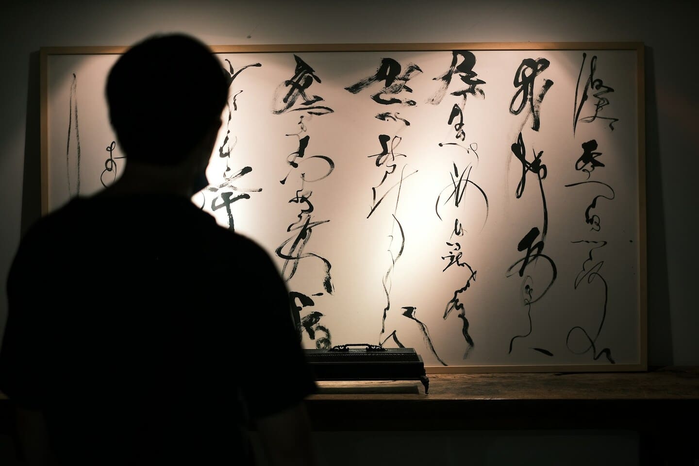
- Japanese Calligraphy as Wall Art: Understanding the Display Tradition
- Traditional Display: The Kakejiku Hanging Scroll
- Western-Style Framing for Japanese Calligraphy
- Conservation Framing: Protecting the Work Long-Term
- Collecting Framed Japanese Calligraphy for Interiors
- Displaying Japanese Calligraphy in Contemporary Spaces
- Discover Nihonga for Contemporary Spaces
Few questions arise more consistently among buyers of Japanese art than how to display what they have acquired. With Japanese calligraphy, the question is particularly pointed: the works come in a variety of physical formats — rolled scrolls, loose sheets of washi, framed panels, album leaves — and the display choices made for each will either honor or diminish the work’s visual intelligence. Getting a japanese calligraphy frame right is not merely an aesthetic decision. It is a conservation decision, a cultural decision, and ultimately a decision about how the work will perform in the space where it hangs for years or decades to come.
This guide covers the full range of display options for Japanese calligraphy — from the traditional kakejiku hanging scroll, which is the native format of the art form, to Western-style conservation framing that integrates calligraphy into contemporary interiors on international terms. It addresses the materials, methods, and considerations that determine whether a framing choice will protect the work or damage it over time, and it offers practical guidance for collectors at every stage, from first-time buyers selecting a single statement piece to experienced collectors managing significant holdings of historical material.
Japanese Calligraphy as Wall Art: Understanding the Display Tradition
To understand the options for displaying Japanese calligraphy today, it helps to understand what the art form is and why the question of display format is more consequential here than it is for, say, a Western oil painting on canvas. Japanese calligraphy (shodo, 書道) is the art of writing Chinese characters (kanji, 漢字) and Japanese syllabic scripts (kana, 仮名) with a brush, black ink, and a variety of supports — primarily washi (traditional plant-fiber paper) or silk. The physical character of the medium — a highly absorbent, relatively fragile organic support carrying a fluid, carbon-based ink — determines most of the practical decisions that follow.
What Makes Japanese Calligraphy Distinctive as a Display Medium
Unlike oil or acrylic painting, Japanese calligraphy on washi cannot be rolled, folded, or handled carelessly without damaging the surface. The ink, though chemically stable, sits on the surface of the paper rather than being bound within a thick paint layer, and physical abrasion or contact will remove it. Washi itself is a hygroscopic material — it absorbs and releases atmospheric moisture — and responds to changes in humidity by expanding and contracting. Any mounting or framing system must accommodate this movement rather than restrain it, or the paper will cockle, crack, or tear over time.
At the same time, sumi ink (墨, ground from carbon-based ink sticks) is among the most light-stable pigments used in any art tradition. Unlike the organic dyes in ukiyo-e prints or many historical painting pigments, carbon black does not fade significantly under normal display conditions. This relative resistance to light means that the primary conservation concerns for framed Japanese calligraphy are humidity control and the acid migration from framing materials — not light exposure, which is the dominant concern for other East Asian art forms.
The Cultural Role of Calligraphy in Japanese Interiors
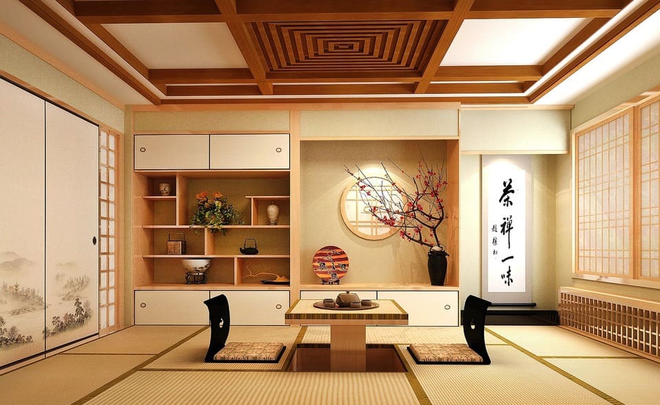
In traditional Japanese domestic culture, calligraphy occupied a specific and honored place in the interior: the tokonoma (床の間), a recessed alcove present in any formal reception room, was the designated display space for a hanging scroll (kakejiku, 掛け軸), a ceramic vessel, and a flower arrangement. The scroll in the tokonoma was changed with the seasons — or with the arrival of specific guests — and its selection communicated the host’s cultivation, taste, and sensitivity to the moment. A scroll bearing the phrase “ichi-go ichi-e” (一期一会, “one time, one meeting”) was hung for a tea ceremony gathering; a landscape scroll appropriate to the current season graced the tokonoma in the family’s main reception room; a scroll with an auspicious phrase or classical poem was displayed for celebrations.
This system of seasonal rotation and contextual display is not merely historical antiquity; it represents a sophisticated theory of how art should function in lived-in space. The works are not permanent fixtures but changing elements of a curated environment, responding to occasion and season in the way that a garden responds to weather. For contemporary collectors and interior designers working with Japanese calligraphy, this tradition offers a model that has no precise equivalent in Western decorating culture — and that is increasingly relevant as interest in intentional, seasonally responsive interiors grows internationally.
Traditional Display: The Kakejiku Hanging Scroll
The kakejiku (掛け軸, hanging scroll) is the native display format of Japanese calligraphy and the format in which the art form is most fully realized. Understanding how a kakejiku is constructed, what its components are called, and how to select and display one correctly is foundational knowledge for anyone collecting Japanese calligraphy.
How Kakejiku Are Constructed
A finished kakejiku is a composite object. The calligraphy itself — written on a sheet of washi or silk — is called the honshi (本紙, main paper). Around this central element, a professional mounter (hyogushi, 表具師) applies layers of silk fabric or paper in a prescribed arrangement of sections. The ichimonji (一文字) are narrow horizontal strips of decorated fabric placed immediately above and below the honshi; the chuumawashi (中廻し) is the main border surrounding the honshi on all four sides; the uwamise (上廻し) is the wider upper section of the scroll above the chuumawashi, and the shitamise (下廻し) is the lower section below it. At the very top of the scroll, two narrow decorative strips called futai (風帯) hang free, echoing the color of the silk mountings.
The entire mounted assembly is backed with multiple layers of washi applied with traditional wheat-starch paste (nori, 糊). This multi-layer backing gives the scroll body, stability, and the ability to roll without cracking. At the top, a wooden rod is enclosed in the fabric; from this rod, a hanging cord (kakeo, 掛緒) is suspended, typically from a single hook or nail. At the bottom, the roller (jiku, 軸) — often made of lacquered wood, ivory substitute, or ceramic — provides weight and serves as the handle when the scroll is rolled for storage.
The choice of silk fabric for the mountings is one of the primary aesthetic decisions in kakejiku production, and it significantly affects the visual impact of the finished work. Formal mounting styles (classified in Japanese as shin, gyo, and so — formal, semi-formal, and informal, analogous to the same classification in calligraphic scripts) use different fabric colors, patterns, and proportions. A calligraphy work in kaisho (楷書, regular block script) suitable for formal display might be mounted in a silk with a subtle gold pattern; a casual ink sketch or a playful haiku in flowing kana would be mounted in a plainer, more restrained silk. Professional hyogushi — of whom a relatively small number practice outside Japan today — can advise on the appropriate mounting style for any specific work.
Choosing and Displaying a Kakejiku
When selecting a kakejiku for a contemporary interior, the primary practical considerations are the available hanging height and the relationship between the scroll’s proportions and the wall space. Traditional kakejiku proportions are tall and narrow — a standard single-panel scroll (ichimawashi, 一廻し) might be 180 to 200 centimeters in total length and 30 to 50 centimeters wide. This format suits contemporary interiors with high ceilings or tall wall fields particularly well, creating a vertical accent that offsets the dominant horizontality of modern furniture.
A single hook or nail driven into the wall at the appropriate height is the traditional hanging method; the hanging cord of the kakejiku loops directly over this point. The hook should be positioned so that the visual center of the honshi (the calligraphy itself, not the total scroll length) falls at approximately the viewer’s eye level when standing. In a room designed primarily for seated use — a tea room or a low-furniture japandi interior — the traditional Japanese hanging height is lower, placing the visual center at eye level when seated on the floor or on low cushions.
Kakejiku should not be displayed in direct sunlight or in spaces with extreme humidity fluctuation. They should be rolled when not displayed, stored in their original wooden box (hakobako, 箱), and allowed to hang for a limited period before being replaced. The traditional maximum display period for a single scroll in a single season is roughly two to three weeks; contemporary collectors with smaller rotations can extend this to several months without significant risk, provided the room’s humidity is reasonably stable.
Seasonal Rotation and the Tokonoma Tradition
For collectors who want to engage fully with the Japanese display tradition, assembling a collection of calligraphy scrolls for seasonal rotation — one scroll or group of scrolls associated with each of the four seasons and major annual occasions — is among the most rewarding approaches. Traditional associations between subjects and seasons provide guidance: plum blossom (ume, 梅) and the character for spring (haru, 春) are displayed in late winter and early spring; subjects associated with coolness, water, or summer grasses belong to the warmer months; autumn foliage (momiji, 紅葉), chrysanthemum (kiku, 菊), and moon imagery are autumn scrolls; pine (matsu, 松), snow, and auspicious characters such as kotobuki (寿, longevity) or fuku (福, good fortune) appear in winter and for the New Year season.
Even collectors who do not maintain a formal tokonoma can apply this principle of seasonal rotation — simply changing the wall-hung calligraphy work with the seasons — to introduce a living, temporally aware quality to their interiors that fixed, permanent displays cannot offer. Several scroll works acquired over time, representing the four seasons in their subject matter and inscription content, form the nucleus of a collection with genuine practical utility and cultural depth.
Western-Style Framing for Japanese Calligraphy
Many collectors prefer to display Japanese calligraphy in a Western-style frame rather than as a kakejiku, either because their interior design context is not suited to the hanging scroll format or because they have acquired works on loose sheets rather than pre-mounted scrolls. Western framing, done correctly, can present Japanese calligraphy to excellent effect; done incorrectly, it can both damage the work and reduce its visual impact.
When to Frame vs. When to Scroll-Mount
The decision between kakejiku mounting and Western framing depends on several factors. If the work is already mounted as a kakejiku by a professional hyogushi, it should not be removed from its mount and re-framed without specialist advice: unmounting is a delicate process that can damage the honshi, and the existing mount may have historical or aesthetic value of its own. Works on loose washi sheets — calligraphy that was never mounted, or that has been removed from an earlier mount — are the appropriate candidates for Western framing.
For works intended for a contemporary Western interior where a kakejiku would look culturally incongruous — a minimalist apartment, a corporate office, a hotel lobby with a predominantly Western design language — Western framing integrates the work more naturally into the environment. For works intended for a japandi or East Asian-influenced interior, kakejiku mounting will almost always produce the more harmonious result.
Frame Materials and Style Considerations
The frame chosen for a Japanese calligraphy work should complement rather than compete with it. Japanese calligraphy in black ink on white or cream washi is visually simple and compositionally spare; the frame must be subordinate to the work, providing a clean transition between the art and the wall without drawing the eye away from the ink marks themselves.
Natural wood frames in pale or medium tones — maple, ash, or lightly finished oak — complement the organic character of washi and echo the natural materials of the japandi palette. Lacquered frames in flat black or deep brown offer a more formal alternative that suits kaisho calligraphy with precise, architectural characters particularly well. Simple metal frames in brushed aluminum or dark iron work in contemporary industrial and Scandinavian-influenced interiors. What almost never works is a decorative Western frame — gilded, carved, or highly ornamental — which creates a clash of aesthetic registers between the frame’s European baroque sensibility and the disciplined restraint of the calligraphy it contains.
Frame profiles should be relatively narrow. A wide, projecting frame overwhelms the typically modest scale of Japanese calligraphy on washi and creates a disproportionate visual weight around the work. A simple, flat or slightly rabbeted profile of 15 to 30 millimeters width is appropriate for most standard calligraphy sizes; very large works may support slightly wider profiles.
Matting Japanese Calligraphy
The mat (or mount board, in British English) — the layer of board between the frame and the artwork that creates a visual border and physically separates the art from the glazing — performs important functions for Japanese calligraphy. It prevents the washi from contacting the glass (which can cause condensation damage and, in certain humidity conditions, cause the paper to adhere to the glass). It creates visual breathing space around the work that allows the calligraphy’s negative space to remain compositionally active. And it provides an opportunity to set the tonal register of the display.
Mat board for Japanese calligraphy should be acid-free and archival quality — this is non-negotiable for any work of value. Standard commercial mat board contains lignin and acidic compounds that will, over time, migrate into adjacent paper and cause the characteristic brown staining known as foxing. Museum-grade mat board, available from specialist framers and conservation suppliers, is buffered to a neutral or slightly alkaline pH and will not damage the artwork it contacts.
The float mounting technique — in which the washi sheet is adhered at its edges to an archival backing board rather than covered at its margins by a conventional mat window — is often the preferred option for Japanese calligraphy, because it allows the entire sheet to be visible, including the edges of the washi and any seal impressions or inscriptions near the margins. Float mounting requires the use of archival Japanese hinges made from kozo washi and reversible wheat-starch or methylcellulose adhesive, applied at the top edge only to allow the sheet to hang free and respond to humidity without restraint.
Mat color choice should be conservative. White, off-white, and pale warm gray are the most reliable mat colors for black ink calligraphy on washi. A mat tone that is very close to but slightly warmer than the washi ground harmonizes naturally with the organic color of the paper. Avoid mat colors that are brighter, more saturated, or cooler than the washi itself; these will create an unintended contrast that shifts the viewer’s attention from the ink to the border.
Conservation Framing: Protecting the Work Long-Term
For any Japanese calligraphy work of significant monetary or sentimental value, conservation-standard framing is not an optional upgrade but a basic requirement. The difference between commercial-grade framing and conservation framing is not primarily the appearance of the finished result; it is the difference between a package that will harm the artwork over decades and one that will preserve it.
Acid-Free Materials Throughout
Every material that contacts or encloses the artwork in the frame package must be archival. This means acid-free mat board (as noted above), acid-free foam core or corrugated board for the backing panel, and any adhesives or mounting hinges must be reversible and pH-neutral. The concept of reversibility — that any mounting decision made today can be undone in the future without damaging the artwork — is central to conservation framing philosophy. An artwork that is permanently adhered to an acidic backing, or dry-mounted (a process using heat-activated adhesive sheets that bonds the work irreversibly to a substrate), cannot be safely removed for future remounting, conservation treatment, or display in a different format.
Dry mounting — still offered by many commercial framers as a standard option — is entirely inappropriate for Japanese calligraphy or any other work on washi. The heat required activates the adhesive throughout the sheet simultaneously, and the resulting bond is irreversible. Works that are dry-mounted cannot be appropriately conserved in the future, and the process significantly reduces both the cultural integrity and the market value of any significant piece.
UV Glass and Light Protection
Although sumi ink is exceptionally light-stable — it is, after all, carbon black, one of the most permanent pigments known — the washi support and any colored elements (decorative ink washes, painted additions, or colored paper borders) are more vulnerable to ultraviolet radiation. UV-filtering glazing — conservation glass or acrylic — reduces UV transmission by 97 to 99 percent compared to standard window glass and is recommended as standard for any framed work of value.
The highest current standard for glazing in conservation framing is museum-quality anti-reflective, UV-filtering glass (products such as Tru Vue Museum Glass or its equivalents from other manufacturers). This glazing combines near-total UV filtration with an anti-reflective coating that eliminates the surface glare that makes standard glass problematic in brightly lit rooms. Its visual effect is as close to unglazed display as is practically achievable while still protecting the work; the glass becomes essentially invisible to the viewer, placing the calligraphy in apparent direct contact with the air of the room.
Humidity, Temperature, and Long-Term Care
Washi is extremely sensitive to humidity variation. In environments where relative humidity swings significantly between seasons — as it does in many temperate climates, particularly in buildings with forced-air heating that reduces winter humidity sharply — the paper will expand and contract with each cycle. A work that is firmly restrained by an overly tight mount or a rigid adhesive bond throughout this process will eventually cockle, crack, or tear.
The target environment for Japanese calligraphy on washi is a relative humidity of 45 to 55 percent and a temperature between 15 and 20 degrees Celsius. These conditions are within the range of a comfortable, well-regulated living space or office. Avoid displaying calligraphy works near heating vents, radiators, air conditioning outlets, or exterior walls in cold climates — all of these create localized humidity and temperature extremes that damage paper over time. Avoid bathrooms, kitchens, and basement spaces for the same reason.
Framed works should be inspected annually for any signs of moisture damage, foxing, or pest activity. Any brown spots, tide lines, or insect damage should be assessed by a conservator who specializes in Asian paper before they progress. Early intervention in conservation problems is almost always less costly and less disruptive than late-stage treatment.
Collecting Framed Japanese Calligraphy for Interiors
The market for Japanese calligraphy as collectable wall art is deep and international, encompassing works ranging from contemporary pieces by emerging practitioners to historical scrolls by major figures of the Heian, Edo, Meiji, and Taisho periods. For collectors approaching the category for the first time with the specific goal of framing and displaying calligraphy in a contemporary interior, a clear understanding of what is available and at what price is the starting point.
Categories of Calligraphy Worth Collecting
Classical Japanese calligraphy divides broadly into three main script traditions, each with distinct visual character and display implications. Kaisho (楷書, regular or block script) produces precise, highly legible characters in which each stroke is distinct and the form of every character is clearly readable even to viewers without knowledge of the Japanese language. A kaisho scroll or framed work communicates structural clarity and formal dignity; it suits spaces where the work functions as a graphic statement — a corporate lobby, a formal dining room, an entrance hall.
Gyosho (行書, semi-cursive script) represents the middle ground between formal precision and flowing movement: strokes within characters are connected where possible, the rhythm of writing is visible in the work, and the overall effect is of controlled fluency. Gyosho is the most widely used script in everyday Japanese calligraphy and the most accessible to collectors who are learning to read the tradition’s visual vocabulary. It functions well in almost any interior context.
Sosho (草書, grass script or fully cursive script) reduces characters to their most abbreviated, gestural forms, connecting strokes across and between characters in flowing chains that prioritize the rhythm of the brush over the legibility of individual characters. A sosho scroll requires no knowledge of the characters it depicts to be appreciated as a visual composition; it is the most purely abstract of the three scripts, and the most naturally aligned with the compositional sensibility of contemporary abstract art. It is also the most demanding to read for non-specialists and is most effective in spaces where the primary engagement is visual rather than literary.
Kana calligraphy (仮名書道) — using the Japanese phonetic syllabary in its hiragana form rather than Chinese-derived characters — has its own long tradition descending from the elegant writing of the Heian imperial court, when the kana scripts were primarily used by women writers (the men preferring classical Chinese). The sinuous, connected brushwork of classical kana calligraphy is among the most immediately beautiful forms of Japanese writing to Western eyes, and works transcribing classical waka poetry have a lyrical quality that makes them particularly suited to residential bedrooms, libraries, and reception rooms.
Zen calligraphy (zenga no sho, 禅画の書) — calligraphy produced by Zen Buddhist monks as a form of teaching or practice — occupies a special place in the collecting market. Works by the Rinzai Zen revivalist Hakuin Ekaku (白隠慧鶴, 1686–1769) represent the extreme end of expressive freedom in the tradition: his brushwork is bold, idiosyncratic, and sometimes bordering on the deliberately grotesque, deployed in the service of communicating Zen insights directly rather than through technical accomplishment. Hakuin’s works command strong prices at major international auction houses and have found a growing audience among Western collectors who respond to their uncompromising energy and philosophical weight.
What to Look For in a Calligraphy Work
Assessing the quality of Japanese calligraphy requires developing visual literacy specific to the tradition. Several criteria apply consistently across scripts and periods. The quality of the line is primary: a great calligrapher’s stroke shows evidence of full commitment — the brush is loaded appropriately, moved with conscious speed and direction, and concluded decisively. Hesitant, tentative strokes that backtrack or wobble are signs of insufficient mastery. The presence of kasure (かすれ, the intentional fraying of a fast dry-brush stroke) should be purposeful and controlled rather than accidental.
Ink gradation — the range of tonal values present in a single work — reflects the calligrapher’s management of the brush’s ink load over the course of a composition. A piece in which all strokes are the same tonal density suggests mechanical production or insufficient training; a work with a living range of tones, from saturated black in the heaviest downstrokes to a light gray in the trailing ends of rapid strokes, demonstrates real mastery of the medium.
Compositional intelligence — the arrangement of characters and lines on the page, the management of spacing and proportion, the relationship between written and unwritten areas — is the final and subtlest criterion. A great calligraphy work has a composition as deliberately considered as any painting; the placement of the final seal impression (rakkan, 落款) that closes the work is as much a compositional act as a documentary one. The seal should not feel appended but integrated, completing the spatial conversation between ink and white ground.
Price Ranges for Collectable Calligraphy
| Category | Entry Level | Mid-Range | Established / Major Works |
|---|---|---|---|
| Contemporary calligraphy (living artists) | $300–$2,000 | $2,000–$15,000 | $15,000–$80,000+ |
| 20th-century masters (Taisho / Showa era) | $1,000–$5,000 | $5,000–$40,000 | $40,000–$200,000+ |
| Zen calligraphy (zenga, incl. Hakuin) | $3,000–$15,000 | $15,000–$80,000 | $80,000–$500,000+ |
| Edo-period calligraphy (documented provenance) | $2,000–$10,000 | $10,000–$60,000 | $60,000–$300,000+ |
| Kana calligraphy (Meiji / Taisho, documented) | $1,000–$5,000 | $5,000–$30,000 | $30,000–$150,000+ |
Price ranges above reflect general market observations across specialist dealers, Japanese auction houses, and major international sales. The established and major works tier typically involves secondary-market transactions for pieces with documented exhibition histories, publications, or works by calligraphers with Living National Treasure designation. Works by major historical figures with strong provenance can substantially exceed the upper figures shown.
Displaying Japanese Calligraphy in Contemporary Spaces
Whether mounted as a kakejiku or framed in conservation glass, Japanese calligraphy performs distinctive functions in the spaces where it is displayed. Understanding these functions helps collectors and designers make purposeful choices about placement, grouping, and scale.
Residential Applications
In a home context, Japanese calligraphy is most naturally suited to spaces where the quality of quiet attention it demands can be experienced. Entrance halls are traditional locations — the viewer encounters the work on arrival and on departure, the scroll or frame marking the transition between outside and inside, public and private. A single hanging scroll or framed calligraphy work in an entrance hall makes a clear aesthetic statement about the household’s sensibility without requiring sustained explanation.
Libraries, studies, and home offices benefit particularly from calligraphy works bearing inscriptions with intellectual or philosophical content — a classical poem, a Zen phrase, a text appropriate to the room’s purpose. Tea rooms and meditation spaces call for subjects that invite stillness: an ensō (円相, the Zen circle), a character representing emptiness (ku, 空) or nothingness (mu, 無), a sparse ink landscape with a few brushed characters.
For residential living rooms and dining rooms, calligraphy works whose subject matter is seasonally appropriate — a spring poem when displayed in spring, a work evoking the coolness of summer water in the hotter months — introduce a temporal responsiveness into the interior that resonates with the japandi aesthetic’s grounding in natural rhythms. Scale should be calibrated to the wall: a single large work, given room to breathe, creates more impact than several smaller works competing for the eye’s attention.
Commercial and Hospitality Contexts
In commercial and hospitality environments, framed Japanese calligraphy works communicate a precise register of cultural sophistication — an engagement with Japanese aesthetic tradition that is serious without being antiquarian, refined without being inaccessible. Hotel lobbies, spa reception areas, private dining rooms, and executive office suites are the environments where this register is most valuable and most legible to the international guests and clients who encounter it.
For commercial applications, large-format works in conservation glazing are typically more practical than kakejiku scrolls: the framed format integrates more seamlessly into standard commercial wall systems, is easier to install and maintain by facilities teams without specialist knowledge of scroll handling, and provides better physical protection for the work in high-traffic environments. The glazing should be anti-reflective to avoid the reflections from ceiling lighting that plague standard glass in commercial settings.
Subject selection for commercial calligraphy should favor works whose content is auspicious, welcoming, or broadly positive in the Japanese cultural register — characters and phrases associated with harmony (wa, 和), gratitude (kansha, 感謝), sincerity (makoto, 誠), or seasonal beauty. Avoid works whose content requires esoteric Zen knowledge to interpret correctly; these are better suited to domestic contexts where the owner can explain them to interested guests. Works bearing the names or images of specific deities, historical figures, or religious content should be selected with awareness of their specific meanings and cultural associations.
For both residential and commercial contexts, professional installation of kakejiku scrolls requires only a single picture hook at the correct height; framed works should be hung with appropriate picture-hanging hardware scaled to the work’s weight, and leveled precisely — even a slight tilt in a framed calligraphy work, with its bold vertical and horizontal strokes, will be immediately visible.
The decision to invest in a great japanese calligraphy frame — whether in the traditional kakejiku format or in conservation glass and archival mats — is ultimately a decision about how to honor what the calligrapher made. Japanese calligraphy is an art of the complete moment: the brush touches paper once, moves with full commitment, and leaves a mark that cannot be revised. The frame or mount that presents this mark to the world should be made with the same seriousness of intention — protecting it for future generations while allowing it to perform its full visual and philosophical function in the present.
Discover Nihonga for Contemporary Spaces
Shop carefully selected Nihonga,
curated by experienced Japanese art dealers
for homes and commercial spaces worldwide.