
Ukiyo-e & Scrolls
Ukiyo-e Woodblock Prints: A Guide to Value and Collecting
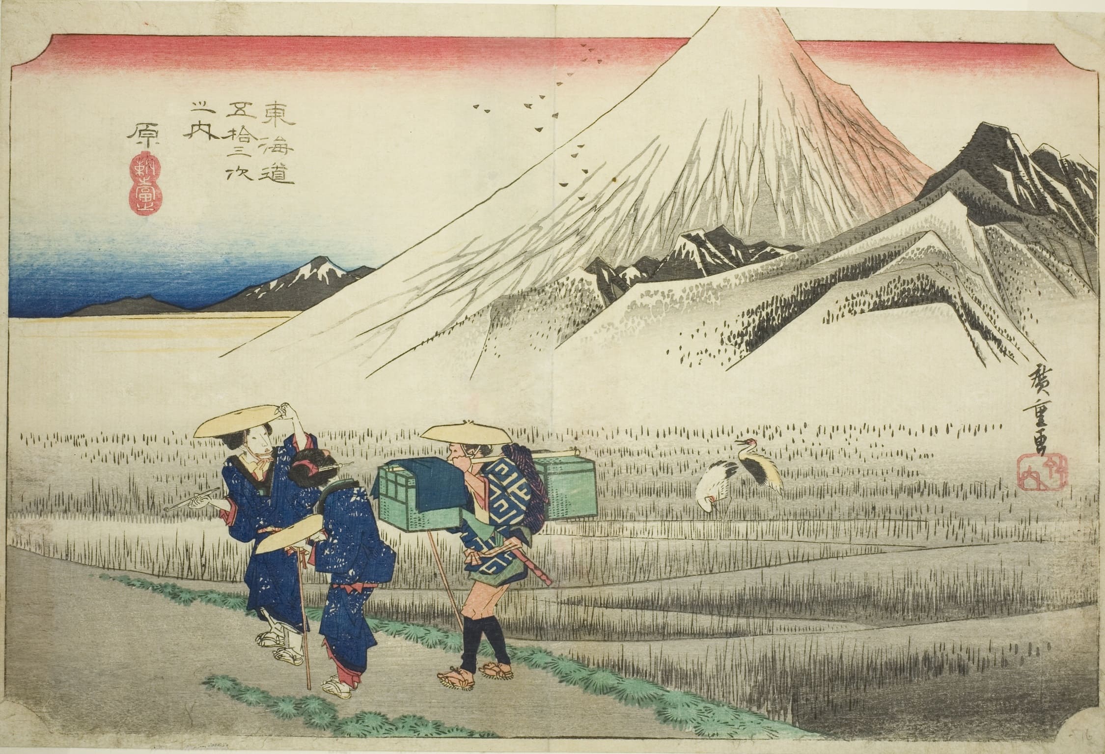
Few objects in Asian art are as immediately recognisable — or as widely misunderstood — as the ukiyo-e woodblock print. A single sheet of mulberry-fibre paper, printed by hand from carved cherry blocks, carries some of the most influential images ever made in Japan: Hokusai’s cresting wave, Hiroshige’s rain-streaked bridge, Utamaro’s half-length beauties. These images shaped European modernism, and they still shape how the world pictures Japan.
What confuses new buyers is that the same design can cost two hundred dollars or two million. Unlike a painting, a ukiyo-e woodblock print exists in multiples — sometimes many thousands of impressions pulled over decades, in varying quality, from blocks that wore down, were recut, or were reissued long after the artist’s death. Value lives in the specifics: which printing, how sharp the carving still reads, how much of the original colour survives, whether the sheet was trimmed, backed, or bleached.
This guide is written for people who intend to buy, advise on, or install these works rather than simply admire them. It covers how prints were produced, which names and series carry the market, what actually drives price, how to separate a lifetime impression from a modern recut, and how a sheet of Edo-period paper behaves once it is framed and hung in a real room with real light.
What a Ukiyo-e Woodblock Print Actually Is
Ukiyo-e translates roughly as “pictures of the floating world” — images of the transient pleasures of urban life in Japan’s Edo period (1603–1868). The term covers both paintings and prints, but in the international market it is usually shorthand for the printed sheet: a commercial, multi-colour woodblock image produced for a broad city audience.
The technical name for the medium is mokuhanga, water-based Japanese woodblock printing. It differs fundamentally from European wood engraving or lithography: no press is used, the pigments are water-based rather than oil-based, and the paper is dampened and rubbed by hand against the inked block. The result is a surface where pigment sits in the fibre rather than on top of it, giving ukiyo-e its characteristic matte depth.
The Floating World and Its Audience
Edo — the city that became Tōkyō — grew into one of the largest urban centres on earth during the seventeenth and eighteenth centuries. Its merchant class had money and leisure but limited social standing, and it spent both on the licensed pleasure quarters, the kabuki theatre, sumo, travel, and fashion. Ukiyo-e was the print media of that world: affordable, topical, and fast-moving.
Prices at the time were genuinely modest. A single-sheet print in the eighteenth century cost roughly what a bowl of noodles cost — these were popular commodities, not luxury goods. That commercial origin matters for collectors today, because it explains both the survival of large numbers of ordinary impressions and the extreme rarity of pristine early ones.
The Main Genres Collectors Encounter
The market organises ukiyo-e by subject, and subject strongly affects demand. Bijin-ga, pictures of beautiful women, is the oldest and most prestigious category, associated above all with Kitagawa Utamaro. Yakusha-e, actor prints, documented kabuki stars in specific roles and productions, and forms the largest single body of surviving material.
Fūkei-ga and meisho-e — landscape and famous-place prints — emerged as a dominant commercial genre only around 1830, with Hokusai’s Mount Fuji series and Hiroshige’s road and city views. This is the category that international buyers respond to most readily, and it commands the strongest prices outside the very top of the figure market.
Alongside these sit musha-e (warrior prints, a speciality of Utagawa Kuniyoshi), kachō-ga (bird-and-flower subjects), shunga (explicit prints, long suppressed and now the subject of serious scholarship), and later Meiji-era categories including war reportage prints and images of Western technology.
From Ink-Only Sheets to Full-Colour Nishiki-e
The medium did not begin in colour. Seventeenth-century prints by Hishikawa Moronobu and his contemporaries were sumizuri-e, printed in black ink alone, sometimes hand-coloured afterwards. Limited two- and three-colour printing followed in the first half of the eighteenth century, using safflower red and vegetal green.
The decisive change came around 1765, when a circle of wealthy amateurs commissioned elaborate privately printed calendars from Suzuki Harunobu. The full-colour prints that resulted were called nishiki-e, “brocade pictures,” and within a few years the technique had moved into commercial publishing. Every canonical ukiyo-e image most people know — Hokusai, Hiroshige, Utamaro, Kuniyoshi — belongs to the nishiki-e era.
How a Ukiyo-e Woodblock Print Is Made

Source:The Art Institute of Chicago(https://www.artic.edu/artworks/36175/artist-block-carver-applying-sizing-eshi-hangashi-dosa-biki-from-the-series-the-cultivation-of-brocade-prints-a-famous-product-of-edo-edo-meibutsu-nishiki-e-kosaku)
Understanding production is not academic detail; it is the basis of connoisseurship. Almost every question a buyer asks — is this early, is this original, why is that one ten times the price — resolves into a question about how and when a particular sheet was printed.
Four Hands, One Sheet
A ukiyo-e print was a collaborative commercial product, not the work of a solitary artist. The hanmoto (publisher) financed and directed the project, judged the market, and owned the blocks. The eshi (designer) supplied a brush drawing on thin paper. The horishi (block carver) pasted that drawing face-down onto a cherry block and cut through it, destroying the original in the process. The surishi (printer) then pulled impressions, one colour at a time.
Because the publisher owned the blocks, they could be reprinted whenever demand justified it, sold to another publisher, recut when worn, or altered — colours simplified, backgrounds changed, signatures removed. Nothing in the system produced numbered editions, and nothing guaranteed consistency. This is why the phrase “original Hiroshige” means very little on its own.
Blocks, Paper, and Pigment
Blocks were cut from yamazakura, mountain cherry, planked along the grain — hard enough to hold fine line, fibrous enough to accept water-based colour. A complex design might require ten or more blocks, often carved on both faces.
The paper is washi, handmade Japanese paper, typically from kōzo (paper mulberry) fibre; the standard grade for quality printing was hōshogami, a soft, absorbent, long-fibred sheet. Pigment was mixed with rice paste and brushed onto the block, and the dampened paper was rubbed against it with a baren — a flat disc wrapped in a twisted bamboo sheath. Accurate colour registration depended on kentō, L-shaped and straight notches cut into every block so each sheet aligned identically.
Colourants matter for dating. Early nishiki-e used organic materials: beni from safflower, indigo, dayflower blue, orpiment yellow. Imported Prussian blue — known in Japan as bero-ai — became commercially available in quantity around 1829 and transformed landscape printing almost immediately; its stability is one reason Hokusai’s and Hiroshige’s blues still read so strongly today. Synthetic aniline dyes arrived from the 1860s and give many Meiji prints their hard magentas and purples.
The Effects That Separate a Fine Print from an Ordinary One
Skilled printers deployed a repertoire of effects that are invisible in reproduction but obvious in the hand. Bokashi is graded tone, produced by wiping pigment across the block by hand so that colour fades from saturated to nothing — the sky in a Hiroshige sunset, the deepening blue at the top of a Hokusai sheet. Because it is achieved manually on every single impression, bokashi quality varies enormously and is one of the first things a specialist looks at.
Karazuri, blind embossing, uses an uninked block to press texture into the damp paper — snow, white robes, feathers. Kirazuri applies powdered mica for a shimmering ground, most famously behind Sharaku’s actor portraits. Shōmenzuri burnishes areas of black to a lacquer-like sheen. Later, cheaper printings routinely omit these steps, which is why two impressions of an identical design can differ by an order of magnitude in price.
The Artists, Series, and Schools That Shape the Market
Ukiyo-e produced hundreds of named designers across two and a half centuries, but a relatively small group carries most of the international market’s value. Knowing where a name sits in that hierarchy — and which series within an artist’s output are sought — is the fastest route to sensible buying.
Hokusai and Hiroshige: The Landscape Market
Katsushika Hokusai (1760–1849) is the most globally recognised Japanese artist of any period. His series Thirty-six Views of Mount Fuji (Fugaku sanjūrokkei), published from around 1830 to 1832 and eventually extended to forty-six designs, contains the two images that anchor the entire ukiyo-e market: “Under the Well of the Great Wave off Kanagawa” and the red-and-white Fuji known as “Fine Wind, Clear Morning.”
The Great Wave was printed in the thousands during the nineteenth century, yet fine early impressions with strong Prussian blue, intact key-block line, and untrimmed margins are genuinely scarce; roughly a hundred-odd examples of varying quality are recorded in institutional and private hands. In March 2023 Christie’s New York sold an impression for $2,760,000, the highest recorded price for a Japanese woodblock print. That figure should be read as the ceiling of an extremely broad range, not as a benchmark.
Utagawa Hiroshige (1797–1858) is the other pillar. The Hōeidō edition of Fifty-three Stations of the Tōkaidō (c. 1833–34) and the late series One Hundred Famous Views of Edo (Meisho Edo hyakkei, 1856–58, comprising 118 designs plus a title sheet) are the most collected bodies of work in the field. Both were reprinted extensively into the Meiji period and again in the twentieth century, so edition identification is essential.
Utamaro, Sharaku, and the Figure Print
Kitagawa Utamaro (c. 1753–1806) refined the half-length female portrait, or ōkubi-e, into the medium’s most psychologically acute form. His finest sheets — often with mica grounds and subtle flesh-tone printing — sit at the top of the figure market, though they are also disproportionately affected by fading, since the safflower pinks he relied on are among the most fugitive pigments in the entire ukiyo-e palette.
Tōshūsai Sharaku remains the field’s great enigma: roughly 140 designs published by Tsutaya Jūzaburō across about ten months in 1794–95, then silence. The mica-ground actor portraits of the first group are among the most valuable prints in existence, and exceptional impressions appear at auction only rarely, typically realising six figures and upward in specialist sales.
Earlier figures matter too. Suzuki Harunobu (1725–1770), Torii Kiyonaga, and Katsukawa Shunshō define the classic period, and eighteenth-century material in strong condition is scarce enough that condition-adjusted prices can exceed those of far more famous nineteenth-century designs.
The Utagawa School and the Meiji Years
The Utagawa lineage dominated nineteenth-century publishing by sheer volume. Utagawa Kunisada (1786–1865, later signing as Toyokuni III) was the most commercially successful designer of his era and produced work in the tens of thousands of designs; Utagawa Kuniyoshi (1797–1861) is prized for inventive warrior prints, ghosts and monsters, and a satirical streak that reads as strikingly modern.
Because output was so large, ordinary Utagawa-school sheets remain the entry point to the field, frequently available in the low hundreds of dollars. Kuniyoshi’s best-known triptychs and Kunisada’s finest early actor portraits are exceptions that trade far higher.
The Meiji period (1868–1912) brought aniline colour, Western subject matter, and the final flowering of the traditional print under Tsukioka Yoshitoshi (1839–1892), whose series One Hundred Aspects of the Moon (Tsuki hyaku sugata, 1885–92) has become one of the most consistently demanded bodies of work in the current market.
Shin-hanga and Sōsaku-hanga: The Twentieth Century
Two twentieth-century movements revived the medium, and both are heavily traded today. Shin-hanga (“new prints”) retained the traditional four-role production system under publishers, above all Watanabe Shōzaburō, but adapted subject matter and atmospheric effects for a modern and largely export audience. Kawase Hasui (1883–1957) and Hiroshi Yoshida (1876–1950) are its commercial leaders, with Itō Shinsui, Hashiguchi Goyō, and Natori Shunsen close behind.
For Hasui in particular, the Great Kantō Earthquake of 1 September 1923 is a dividing line: Watanabe’s stock and blocks were destroyed, making pre-earthquake designs materially rarer than the well-known post-1923 output. Distinguishing lifetime impressions from later Watanabe printings — identifiable through seal variants — is the central skill in this segment.
Sōsaku-hanga (“creative prints”) took the opposite path, insisting that the artist design, carve, and print the work themselves. Onchi Kōshirō, Hiratsuka Un’ichi, Saitō Kiyoshi, and Munakata Shikō — who won major prizes at the São Paulo Biennial in 1955 and the Venice Biennale in 1956 — produced work in genuinely small numbers, which gives the category a scarcity profile closer to Western fine-art printmaking.
What a Ukiyo-e Woodblock Print Is Worth
Price in this field is a function of four variables applied in sequence: who designed it, which printing it is, how well that particular sheet was printed, and what condition it is in now. Two of those four have nothing to do with the artist, which is why catalogue photographs are an unreliable guide and why condition reports repay close reading.
Impression, Colour, and Condition
An early impression shows crisp, unbroken key-block line, fully realised bokashi, and any embossing or mica still present. As blocks wore, fine lines broke up and printers simplified colour work; late impressions from tired blocks can look flat and coarse even when the design is identical.
Colour is the most common casualty. Safflower pinks and reds, dayflower blue, and many organic yellows fade badly under light exposure; a Hiroshige sky that has gone from deep blue to grey-brown, or an Utamaro robe that has faded from rose to buff, will typically cost a fraction of a well-preserved example. Blues based on Prussian blue and indigo hold far better, which partly explains the resilient market for Hokusai’s Fuji series.
Physical condition covers trimming (many prints were cut down to the image, removing margins and often the publisher’s mark), backing or laying down on secondary paper, album binding holes along one edge, wormholes, foxing, staining, creasing, and past restoration such as bleaching or in-painting. Trimming and aggressive bleaching are the two interventions that most reliably suppress value; sensitive Japanese-paper repair by a competent conservator is far less damaging to price.
Lifetime Editions, Later Printings, and Modern Reproductions
Since ukiyo-e was never issued in numbered editions, the useful distinction is between a printing made during the artist’s active career from the original blocks, a later nineteenth- or twentieth-century printing from those blocks or recut copies, and a modern reproduction cut afresh from a photographic source.
Reproductions are not forgeries and are openly produced by respected workshops — the Adachi Institute of Woodcut Prints in Tōkyō, founded in 1928, and the Takamizawa workshop being the best known. They are made by hand with traditional materials and can be beautiful objects for decorative use, but they belong to a different market, generally trading in the low hundreds of dollars. Problems arise only when they are sold, knowingly or otherwise, as period impressions.
Practical indicators of a modern recut include paper that is bright, even, and machine-smooth; line work that is uniformly perfect with no wear; colours outside the historical palette; and the absence of the slight cockling and tonal variation that comes with age. Ultraviolet examination and, where the sum justifies it, a specialist opinion are worth the cost above roughly the five-thousand-dollar level.
Reading Signatures, Seals, and Publisher Marks
Most Edo-period commercial prints carry more information than buyers realise. Alongside the artist’s signature sit the publisher’s mark, and — critically — censor seals, which allow surprisingly precise dating. The round kiwame (“approved”) seal was in use from 1790 to 1842; named censor seals followed from 1842 to 1853; combined censor-and-date seals using the zodiac calendar appeared from the early 1850s; and aratame (“examined”) seals dominate from 1857 into the Meiji period.
A print whose date seal disagrees with the claimed publication period is either a later printing or misdescribed. Publisher marks that were removed or replaced during recutting are another tell. Reference works and the online databases maintained by major museums make this checkable in minutes, and any reputable dealer will discuss it openly.
Indicative Price Bands
The figures below are indicative ranges drawn from specialist sales at Christie’s, Bonhams, and Sotheby’s and from established dealer catalogues over roughly 2019–2025. They describe the middle of each market, not its extremes, and condition can move any line up or down by a factor of ten.
| Category | Typical range (USD) | Notes |
|---|---|---|
| Utagawa-school actor and warrior prints, average condition | $150–$800 | The volume end of the market; abundant supply |
| Hiroshige landscapes, later printings, moderate condition | $800–$4,000 | Faded skies are common; check bokashi |
| Hiroshige, fine early impressions from key series | $8,000–$60,000 | Hōeidō Tōkaidō; One Hundred Famous Views of Edo |
| Yoshitoshi, One Hundred Aspects of the Moon | $800–$8,000 | Strong and steady demand; condition-sensitive |
| Hokusai, Thirty-six Views, designs other than the Great Wave | $10,000–$150,000+ | “Fine Wind, Clear Morning” at the upper end |
| Hokusai, “Great Wave off Kanagawa” | Six figures to $2,760,000 | Record: Christie’s New York, March 2023 |
| Utamaro, fine bijin-ga half-length portraits | $30,000–$400,000+ | Fading of pink tones is the dominant risk |
| Sharaku, mica-ground actor portraits | Six figures upward | Very few impressions reach the open market |
| Kawase Hasui, lifetime impressions | $400–$6,000 | Pre-1923 designs materially scarcer |
| Hiroshi Yoshida, lifetime impressions | $800–$10,000 | Look for the jizuri seal on self-supervised printings |
| Sōsaku-hanga (Munakata, Onchi, Saitō) | $1,000–$50,000+ | Small runs; closer to Western print-market dynamics |
| Modern recut reproductions (Adachi, Takamizawa and similar) | $80–$400 | Handmade, openly produced, decorative market |
Where Prints Change Hands
Dedicated Japanese-print sales at Christie’s, Bonhams, and Sotheby’s set the visible benchmarks, alongside Japanese auction houses including Shinwa and Mainichi. A significant volume of the finest material, however, moves privately through a small group of specialist dealers in New York, London, Tōkyō, and continental Europe, where condition can be examined in person and provenance discussed at length.
For calibrating the eye before buying, museum collections are the best free resource available. The Art Institute of Chicago, the Museum of Fine Arts Boston — whose Spaulding Collection, given in 1921 with the condition that it never be exhibited to light, preserves colour almost as printed — the British Museum, the Metropolitan Museum of Art, and the Honolulu Museum of Art’s Michener Collection all publish extensive online catalogues. In Japan, the Ōta Memorial Museum of Art in Tōkyō, the Sumida Hokusai Museum, and the Japan Ukiyo-e Museum in Matsumoto offer rotating displays.
Living with Ukiyo-e: Scale, Light, and Interiors
A ukiyo-e woodblock print is a small, light-sensitive object on handmade paper, and it behaves accordingly on a wall. The practical questions — how large does it actually read, how bright can the room be, how do you build presence from modest sheets — are the ones that most often go unasked before purchase and most often cause regret afterwards.
Formats and How They Read on a Wall
Edo-period paper sizes were standardised, which makes planning straightforward. The dominant single-sheet format is ōban, roughly 39 × 26 cm (about 15 × 10 inches) — smaller than most people expect from reproductions. Multi-sheet compositions were common, and a triptych of joined ōban sheets gives a horizontal image approaching 80 cm wide, which changes the interior calculation entirely.
| Format | Approximate size | Typical use |
|---|---|---|
| Ōban | 39 × 26 cm (15 × 10 in) | The standard single sheet; most landscapes and portraits |
| Chūban | 26 × 19 cm (10 × 7.5 in) | Harunobu-period figures; smaller series |
| Hosoban | 33 × 15 cm (13 × 6 in) | Early actor prints; often issued in sets |
| Ōban triptych | 39 × 78 cm (15 × 31 in) overall | Panoramic scenes; strong horizontal presence |
| Kakemono-e | 76 × 23 cm (30 × 9 in) | Two sheets joined vertically; hanging-scroll proportion |
| Surimono (shikishiban) | 21 × 18 cm (8 × 7 in) | Privately commissioned; lavish printing, intimate scale |
For a large wall, the honest options are a triptych, a vertical kakemono-e format, or a deliberate group. Enlarging the mat around a single ōban to fill space rarely works: the sheet floats, and the delicacy that makes the medium compelling is lost.
Framing, Glazing, and Light Levels
Conservation framing is not optional here, and it is the single most consequential decision a buyer makes after acquisition. The print should be hinged with Japanese paper and wheat-starch paste onto an acid-free, lignin-free backing, never dry-mounted, taped with pressure-sensitive adhesive, or trimmed to fit. Any framer who proposes cutting the sheet should be declined.
The window mat must hold the glazing off the paper surface, and the glazing itself should filter ultraviolet light — museum glass or UV-filtering acrylic. Acrylic is lighter and safer in hospitality settings, though it carries a static charge and should not be used with any print with flaking or friable pigment.
Light is the irreversible threat. Museums generally display works on paper at around 50 lux and manage cumulative exposure through rotation, because fading is a function of total light dose over time and cannot be undone. In a domestic or commercial setting the practical translation is simple: never hang an ukiyo-e print in direct sunlight or under a focused spotlight, keep it off south-facing walls with unfiltered glazing, and consider rotating framed works into storage for part of each year. Stable relative humidity in the region of 45–55 percent and a wall away from exterior damp will handle the rest.
Grouping, Hospitality, and Commercial Spaces
Because the individual sheet is small, ukiyo-e rewards serial hanging. A sequence of four to six prints from a single series — stations along the Tōkaidō, views of Edo across the seasons — reads as one coherent work at architectural scale while preserving the intimacy of each sheet. Uniform frames and consistent mat proportions do most of the work; varied framing fragments the effect.
Palette is worth planning around. Landscape prints from the 1830s onward are dominated by Prussian blue, indigo, and warm ochres, which sit comfortably against plaster, oak, and stone but can be swallowed by heavily patterned walls. Actor and beauty prints carry more red and black and hold their own in darker, more enclosed rooms.
For hotels, restaurants, offices, and other commercial interiors, the calculation shifts. Period prints in high-traffic public areas face light exposure, humidity swings, and handling risk that most collectors would not accept, and insurance and security add cost. Many design teams reserve original impressions for controlled settings — private dining rooms, executive floors, suites — and use high-quality traditional reproductions in circulation spaces, which is an entirely legitimate approach provided nothing is misrepresented.
From the Floating World to Nihonga
Ukiyo-e’s influence did not end with the Edo period. Its flattened space, cropped compositions, and decorative line reached Europe through the trade of the 1860s and 1870s and became central to Japonisme, informing Monet, Degas, Whistler, Mary Cassatt, Toulouse-Lautrec, and Van Gogh, who copied Hiroshige directly. Within Japan, the same visual inheritance flowed into Nihonga — the term coined in the Meiji period for painting made with traditional Japanese materials, mineral pigments and ink on silk or paper, as distinct from Western-style oil painting.
The connection is not merely conceptual. Shin-hanga designers such as Itō Shinsui and Kaburagi Kiyokata worked as Nihonga painters as well as print designers, and the mineral pigments known as iwa-enogu that give Nihonga its granular, light-catching surface are cousins to the mineral colourants used in the finest printed sheets. Collectors who begin with ukiyo-e frequently find that Nihonga answers the questions the prints raise — about scale, about surface, about how a Japanese picture occupies a wall.
Nihonga also resolves several of the practical constraints described above. Painted works are made in unique examples rather than editions, they are produced at architectural scale as well as intimate ones, and their mineral pigments are markedly more stable under gallery lighting than the fugitive organic colours of an Edo print. For a room that needs a single anchoring work rather than a sequence of small framed sheets, that is often the more workable answer.
If the logic of ukiyo-e — its restraint, its structured colour, its confidence with empty space — is what draws you, that same sensibility continues in the Nihonga tradition, in works made to be lived with rather than kept in a solander box.
Discover Nihonga for Contemporary Spaces
Shop carefully selected Nihonga,
curated by experienced Japanese art dealers
for homes and commercial spaces worldwide.